
Certain missteps in website design can not only impede user experience but also lead to legal repercussions and a loss of public confidence. By understanding and avoiding these common pitfalls, government agencies can ensure their websites serve the public effectively and efficiently. Let's delve into some of the most frequent design mistakes and explore how to circumvent them, ensuring your agency's site is both compliant and user-friendly.
Lack of Clear Navigation
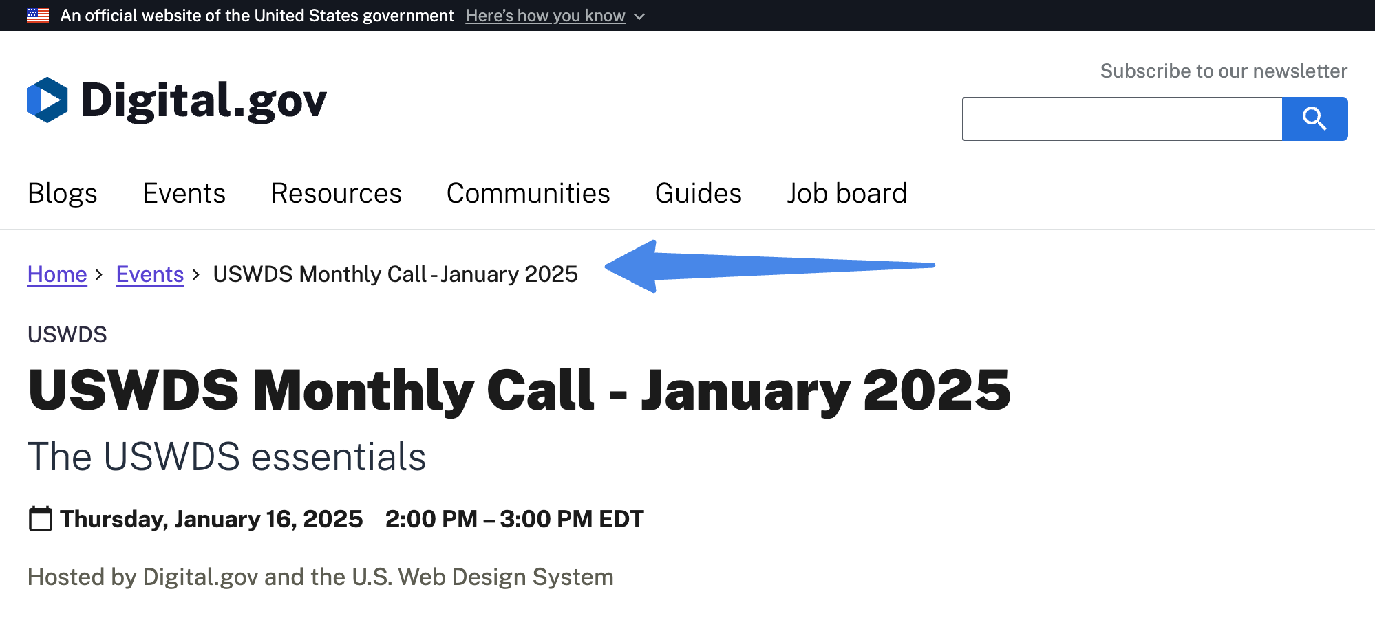
Clear navigation is the backbone of any effective website. For government agencies, where users come seeking crucial information or services, intuitive navigation isn't just a convenience it's a necessity. When navigation is confusing or convoluted, it can lead to frustration, misinformation, and a general breakdown in communication.
How to Avoid
- Implement a Clear, Hierarchical Menu Structure: Use plain language, and group related content logically.
- Conduct User Testing: Test with real users regularly to identify navigation pain points.
- Use Breadcrumbs: Help users track their location and move backward intuitively.
- Offer a Site Map and Search Function: Give users additional paths to find content.
- Keep it Consistent: Ensure navigation elements are uniform across all pages.
- Mobile Optimization: Make sure navigation works well on touchscreens and smaller devices.
Ignoring Accessibility Standards
Accessibility is not just a design preference; it's a legal and ethical obligation. This includes serving users with vision, hearing, and motor impairments. Overlooking accessibility can alienate a sizable portion of the population and lead to ADA violations.
How to Avoid
- Adhere to WCAG Guidelines: Follow Web Content Accessibility Guidelines for compliance.
- Regular Audits: Use tools like WAVE, but don't skip manual testing.
- Educate Your Team: Make accessibility a shared responsibility.
- Provide Alternatives: Include alt text, captions, and keyboard-accessible controls.
Overloading with Information
Government websites often carry large volumes of content, but dumping everything on users at once is counterproductive. It’s overwhelming and ineffective.
How to Avoid
- Use Clear Headings and Bullet Points: Make content scannable.
- Use Concise Language: Ditch the legalese and keep it simple.
- Prioritize Information: Surface the most relevant content first.
Underestimating Mobile Users
Mobile users are not a niche audience. They are the majority. A site that isn’t mobile-optimized excludes a massive chunk of potential users.
How to Avoid
- Start with Mobile-First Design: Build for small screens first, scale up.
- Use Responsive Design: Ensure layouts adapt smoothly to all devices.
- Test on Multiple Devices: Check performance across browsers and screens.
Poor Content Organization
If users can't understand the layout or flow of content, they’re likely to bounce or worse, call support.
How to Avoid
- Use Clear Hierarchies: Structure information from most to least important.
- Use Clear Labels: Avoid ambiguity in headers and navigation labels.
- Design Effective Layouts: Create visual pathways with clear breaks and direction.
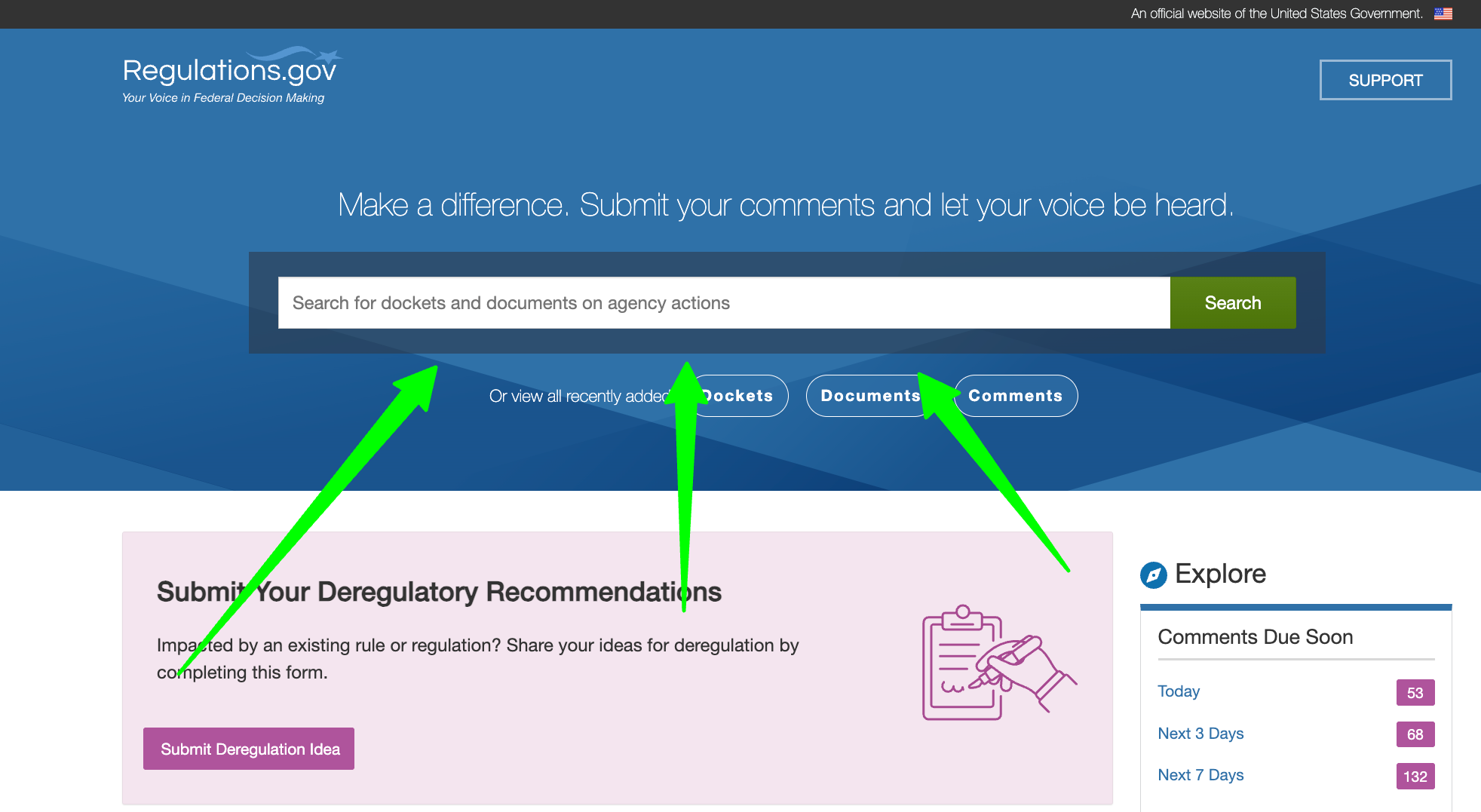
Overlooking Search Functionality
A solid search tool is a lifeline. Without it, users get lost in a sea of content.
How to Avoid
- Prominent Search Bar: Place it where users expect it top and center.
- Efficient Search Logic: Ensure it delivers relevant results quickly.
- Maintain an Updated Index: Include current content and remove outdated pages.
Using Outdated or Inconsistent Visual Elements
A dated or disjointed design can harm credibility. People judge a site by its look in milliseconds.
How to Avoid
- Refresh Regularly: Keep your design modern and functional.
- Follow Brand Guidelines: Stay consistent with fonts, colors, and logos.
- User Testing: Gather real feedback before finalizing design changes.
Neglecting User Feedback
Users will tell you what’s broken if you listen. Ignoring their feedback is a missed opportunity for improvement.
How to Avoid
- Enable Feedback Tools: Offer simple feedback options throughout your site.
- Act on Feedback: Regularly review comments and address them.
- Engage Actively: Run surveys or user interviews to get deeper insights.
Failing to Optimize for Speed and Performance
No one waits for a slow-loading government page. If it takes too long, it might as well not exist. Make sure to optimize for speed and performance.
How to Avoid
- Optimize Images and Code: Compress media, minify scripts, and eliminate bloat.
- Reduce Heavy Scripts: Use only what’s needed, when it’s needed.
- Regular Performance Tests: Use tools like Google PageSpeed Insights to monitor site health.
Ignoring Analytics and User Behavior
If you’re not tracking how people use your site, you’re designing blindfolded. Analytics reveal what works and what doesn't.
How to Avoid
- Use Analytics Tools: Implement tracking with platforms like Matomo or Google Analytics.
- Review Data Regularly: Set up dashboards and dig into reports monthly.
- Take Action: Use insights to refine design and content continuously.
Conclusion
Avoiding these common website design mistakes can dramatically improve how well your government website serves the public. Remember, the goal is not just a functional website, but one that is intuitive, inclusive, and inspiring trust. Continuous iteration informed by real user data and feedback is key. If you need help getting there, consult with web professionals who understand both compliance and modern UX.
Public service deserves a public-friendly web presence. Let’s build one that works for everyone.