UX also has the ability to decrease losses and increase the eCommerce store’s conversion rate.
Research suggests that a good UX can increase the conversion rate by up to 400% and for every $1 spent, online stores can expect an ROI of $100.
But a bad UX can do the opposite.
An eCommerce UX goes far beyond just a pretty design. A slow-loading page or a page without the right CTA won’t contribute to your conversion rate and your sales.
Since your store is where the transaction takes place, you need to pay heed to other significant factors that contribute to the user experience.
Listed below are some of the ways to optimize your eCommerce UX.
Organized Website Structure
First impressions matter. And 94% of first impressions of an eCommerce site are made from its design. A sleek design and seamless website navigation make it easy for visitors to find products and services and motivate them to explore the store. Some of the things you need to consider are:
- Choose stable color palettes that complement your brand
- Have ‘sort by’ and ‘filter’ options to make it easier for visitors to search for their desired products
- Follow some standard eCommerce store protocols like keeping the cart at the top right corner of the website. Familiarity is convenient for users.
- Have an internal search button
Your homepage will get the maximum traffic. So make sure that your visitors are tempted to browse through the products rather than leave because they were lost or disoriented after landing on your site.
Organize your Check Out Process
Now imagine, you succeeded with your homepage design, and the customer decided to move further and browse through the latest collections. They’re having a great experience until they finally land on your checkout page.
They see that they cannot find the necessary details of their purchase. Or there is a long list of details to be filled in. Or there are no clear indications of payment options. The list goes on. The user will likely abandon the cart and you may miss out on a sales opportunity.
To avoid the above mentioned mishaps, follow these points to organize your checkout process:
- Don’t have multiple checkout pages. Instead, use short forms that get the job done and make it convenient for users to fill quickly and move towards payment.
- Be transparent about the shipping costs
- Provide tracking of the order fulfillment process
- Remove distractions from the checkout page like popups and ads
- Clearly provide a list of the payment options
Prioritize Functionality
More than being fancy or making it creative, focus on how you can make your UX more functional. That means getting rid of the fluffy stuff and only keeping elements that add value to your site. Avoid going for elements because they ‘look nice’.
Chances are these elements will come with their glitches. Some examples include transparent buttons, parallax scrolling, and image sliders. They can hinder the user experience and ultimately have a negative impact on SEO. Ensure that all the elements on your website have some role in leading the visitor towards making a purchase.
Optimize your Mobile Store UX
Navigating an online store on mobile is a completely different experience compared to a desktop. Most brands fail to acknowledge these changes. According to research, 54% of eCommerce sites have mobile UX issues.
Your visitors come with different intentions and contexts when they’re visiting from their mobile devices. Some of the things you can keep in mind while optimizing your mobile UX are:
- Allow pinch and zoom-in for product photos
- Highlight important features like guest checkout
- Choose the right keyboard for mobile
- Have options to save carts in case users want to complete the transaction from desktops
- Iterate your pop-ups for a mobile experience
- Have sticky navigation bars
Use High-Quality Images
Online shoppers rely extensively on images of products. Having high-quality images is the least an online store can do since they fill in the gap between online shopping and brick-and-mortar shopping. If your images mislead the buyer, you will ultimately have to incur the costs of reverse logistics. Instead, pay attention to the quality and a well-written description that compliments the product. Some other tips to follow are:
- Take the picture from various angles to showcase the product in its entirety
- Take close-up pictures to show its texture
- Add pictures of the product in use
 Image Source Developer https://www.madesimplemedia.co.uk/
Strategically place the CTAs
If you’ve everything right but still not achieving the conversion rate, it’s time to focus on redoing your CTA. For online stores, your Call-to-Action (CTA) can range from ‘Add to Cart,’ or ‘Buy now,’ buttons.
If your visitors have trouble finding these buttons or even fail to capture attention, your sales can dwindle as your traffic isn’t moving forward with the process. Your CTA needs to stand out from the rest of the page. You can do that by adding a different color palette and bold lettering and keeping the CTA brief but compelling.

Image Source Developer https://www.jero.co.nz
UX-friendly Customer Support
Even if you build the ultimate eCommerce store, let’s face it, your customers are going to encounter some problems in their journey. In a brick-and-mortar store, customers can always approach a salesperson. Your online store also needs to have a UX-friendly ‘virtual salesperson’ that can assist the visitor and encourage them to make the purchase.
You can do that via a chatbot or a self-service portal. But your UX needs to highlight these options so that the customer can seek immediate help and continue its journey.
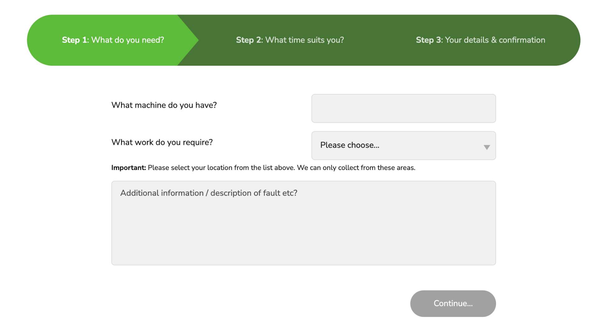
Image Source Developer https://www.madesimplemedia.co.uk/
For example, you can add a chatbot popup to notify the users of its presence.
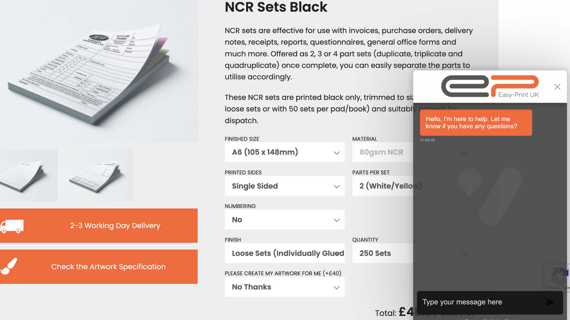
Image Source Developer https://www.madesimplemedia.co.uk/
Wrapping up
Optimizing your eCommerce store’s UX should be your top priority. You never know when trivial UX issues result in millions of lost customers. To steer clear of potential problems arising from poor UX, perform regular activities to cross-check your UX performance. It ultimately helps you provide an exceptional online shopping experience to your customers.