
You know that moment when you're ready to sign up, buy, or submit a form, and then the website just gets in the way? The button is missing, the form is long, or you're not sure what happens next.
That is where conversions die. And the culprit is usually a broken or confusing user flow.
Let’s fix that.
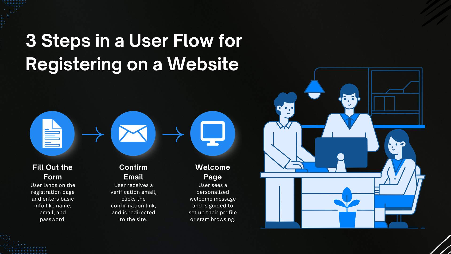
What is a User Flow?
A user flow is the path someone takes on your website to complete a task. It might be signing up for an account, submitting a contact form, or downloading a PDF. It starts with where they land and ends with what you want them to do.
Good user flows feel effortless. Bad ones feel like work. The more friction people hit along the way, the more likely they are to leave without converting.
If you're still unsure how this differs from behind-the-scenes processes, this breakdown of user flow vs workflow differences gives you the clarity you need.
Why It Matters for Conversions
You can design a gorgeous homepage. You can write brilliant headlines. But if the path from interest to action isn't clear, users will drop off.
User flows are the connective tissue between intent and outcome. They turn curious visitors into leads, customers, or subscribers. And they do it without making people think too hard.
If someone clicks a call-to-action button and then hits a wall, they're gone. Every extra step or confusing moment is a lost opportunity.
Six Ways to Create a Better User Flow
1. Start with the Goal
Know exactly what your user wants to do. It could be scheduling a demo, subscribing to updates, or accessing a document.
Everything you design should help them get there as quickly and clearly as possible.
2. Map the Journey
Journey map the entire path from entry point to completion. Include every screen, tap, click, and decision.
Ask yourself:
- Where do they begin?
- What are they trying to do?
- Where might they get confused or stop?
Write it out or sketch it. Seeing it visually makes problems obvious.
3. Eliminate Unnecessary Steps
Simplify. Shorten forms. Use smart defaults. Remove anything that doesn't serve the goal.
Every added field or click is a chance for someone to leave.
If your form looks like it was designed by a tax accountant, it's time to rethink it.
4. Give Clear Feedback
When someone takes an action, show them what happened. A confirmation message, a thank-you page, or even a success icon builds confidence.
Nothing is worse than clicking submit and wondering if anything worked.
5. Track Behavior
Use analytics tools to see how people move through your site. Where do they pause? Where do they leave?
With privacy-focused platforms like Matomo, you can track this behavior responsibly.
6. Keep Improving
User flows are never finished. Test different layouts, button labels, and form lengths. Even small changes can have a big impact.
Use A/B testing or heatmaps to see what helps users move forward.
A Quick Example
Say you're running a local government site. You publish a new resource on housing programs. A visitor clicks to read it and wants to apply.
If your site has a short form, clear instructions, and immediate confirmation, they'll complete the task with ease.
If they get redirected, asked irrelevant questions, or never see a success message, they may give up halfway through.
One gets you a successful conversion. The other sends someone back to Google.
Common Mistakes
- Forms that ask for too much information
- Confusing labels or unclear next steps
- Redirects that break the experience
- Pages that aren't mobile friendly
- Leaving users unsure if anything worked
Try going through your site like a first-time visitor. Find every sticking point and smooth it out.
The Bottom Line
User flows make or break your website’s ability to convert. The best ones feel invisible. They just work.
You don’t need fancy features. You need clarity. Fewer steps. Faster feedback. A clear beginning and end.
If your CMS makes it easy to build and test these flows, even better. Platforms like Concrete CMS let you focus on what matters guiding people to act without getting in their way.
Want more ideas? Start by exploring how user flows shape digital experiences, and build from there.