We’ve all seen it: a flashy animation that looks cool for about two seconds then becomes a headache every time you try to use the interface. Done wrong, motion feels like a gimmick. But done right? It’s a quiet powerhouse that can guide users, reduce confusion, and make a digital experience feel polished.
Motion That Makes Sense: Using Animation to Improve UX (Without Annoying Anyone)
When UI animations are subtle, unobtrusive, and brief, they can improve the user experience and can communicate feedback and state changes, prevent disorientation, and strengthen signifiers.
Nielsen Norman Group
Every year, events like Google I/O showcase the cutting edge of web technology and user experience. This year, I was particularly struck by the renewed emphasis on how subtle, purposeful motion can transform a digital interface.
What does that mean, and why should you care? Let’s break it down.
Problem: Animations That Distract
Too often, animations are used for decoration instead of communication. Think of a loading spinner that loops too long, a modal that slides in like it’s on a Broadway stage, or a button that jiggles "just because."
This kind of motion doesn't help the user; it slows them down. Even worse, it can alienate users with motion sensitivity especially if you haven't honored their "reduce motion" settings.
When Animation Goes Wrong: Examples
To truly understand helpful animation, it’s useful to see what happens when motion takes over or works against the user. Here are a couple of examples that, while perhaps visually striking to some, can create a less-than-ideal user experience:
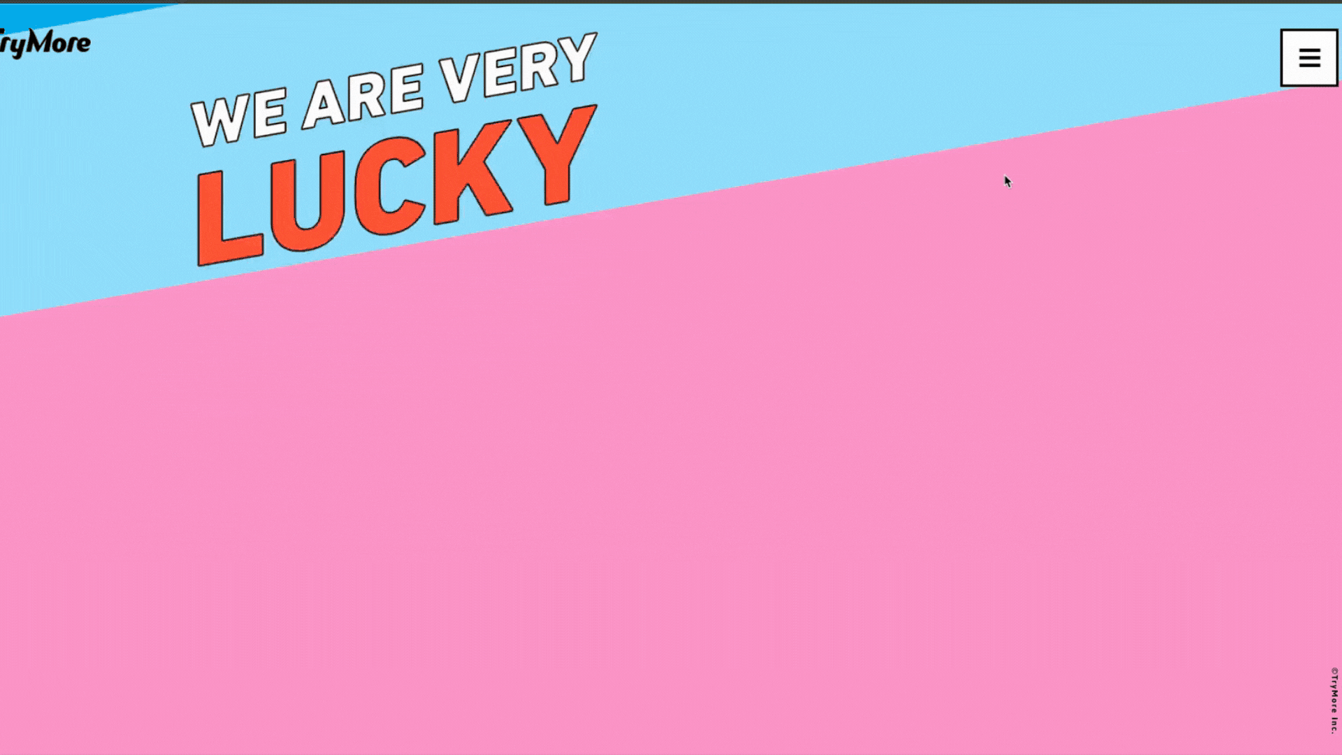
Example 1: Overwhelming and Continuous Motion
Take a look at a site like Trymore Inc. (link opens in a new tab). While it has a distinct aesthetic, the constant, rapidly animating logo and background patterns can be visually taxing. It forces the user to wait for the intro animation, and the continuous movement throughout the page can make it hard to focus on the actual content. This is a case where animation becomes the main event, rather than a supporting element.
Example 2: Persistent Decorative Motion
Another example, though more subtle, can be seen on Humaan. Their main "Humaan" text on the landing page features a continuous, somewhat wobbly animation. While their other animations (like elements sliding in on scroll) are generally well-executed and purposeful, this particular piece of continuous, decorative animation doesn't offer a functional benefit. For some users, especially those sensitive to motion, even subtle, non-stop movement can be distracting when they're trying to read or absorb information.
In both of these cases, the animation draws attention to itself rather than supporting the user’s task. It highlights the importance of asking: "Does this motion truly help my user, or is it just distracting?"
Solution: Supportive, Purpose-Driven Animation
The best animations feel invisible. You don’t notice them because they’re doing their job: reinforcing what just happened, where something went, or what changed.
Here’s how to do that well:
- Keep it short. As indicated by both Nielsen Norman Group and Material Design, the optimal duration for most UI animations falls within a specific range. While some suggest around 100-300 milliseconds (think of a quick blink!), others extend this to 500 milliseconds (half a second) for more complex movements. The key is to be just long enough to catch the eye without slowing things down.
- Use natural movement. Linear motion feels robotic, like a robot moving at a steady pace. Instead, use easing to create natural-feeling movement, like a car slowing down as it pulls into a parking spot, or speeding up as it exits a highway.
- Add motion with meaning. Don't just animate for the sake of it. Every movement should have a purpose.
- Respect user preferences. Always ensure your site can be used by people who prefer less motion, like those with vestibular disorders. Many devices have a "reduce motion" setting, and your design should gracefully adapt.
What Does Helpful Animation Look Like?
Instead of being distracting, helpful animations are the quiet workhorses of a good user experience. They anticipate your needs, provide clarity, and make interacting with digital interfaces feel intuitive.
Here are some common examples you likely encounter every day:
- Confirming Your Actions:
- Button feedback: When you tap a button, it might subtly glow, press in, or briefly change color. This tiny animation confirms your tap was registered.
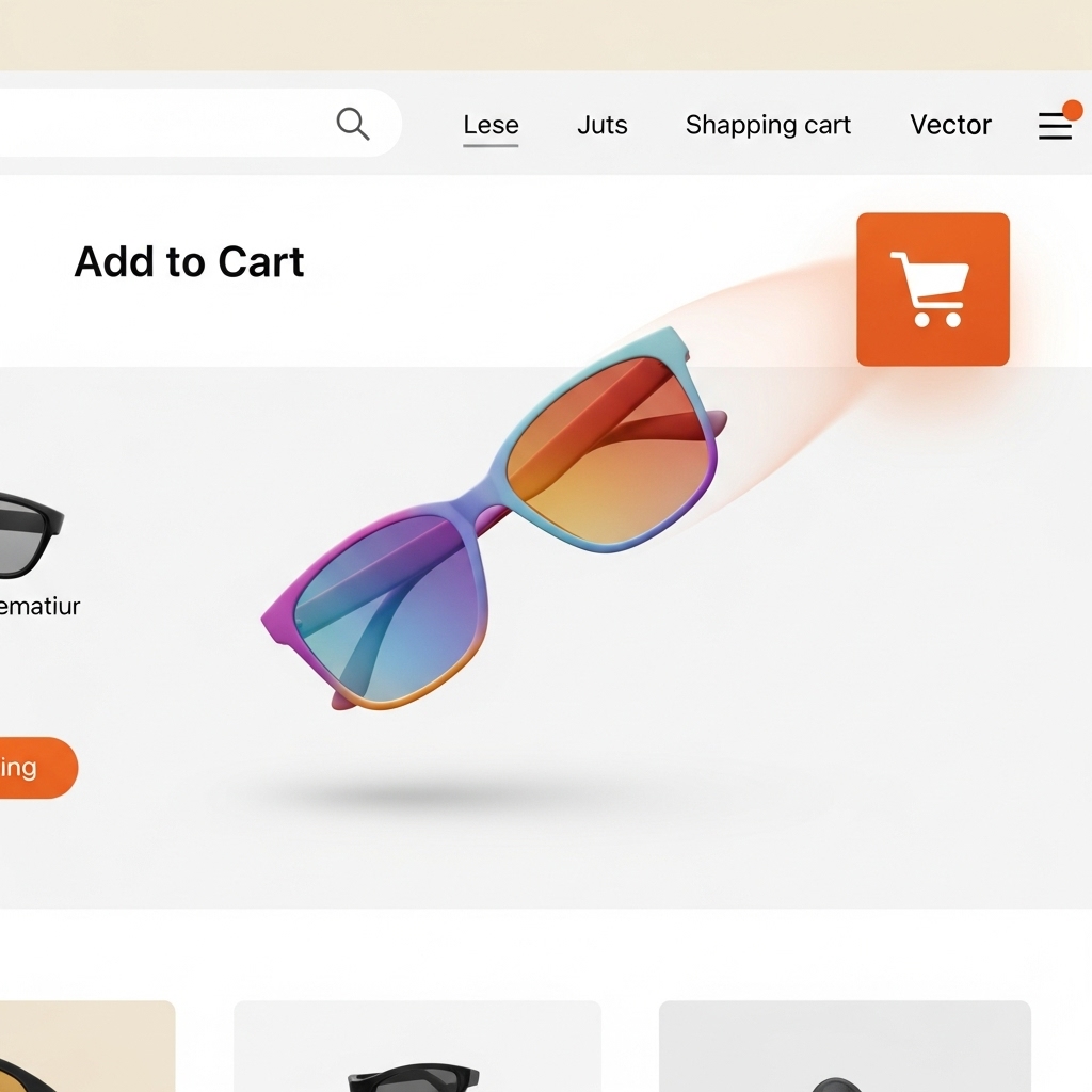
- "Add to Cart" animations: Ever seen an item seemingly "fly" into your shopping cart icon after you click "add"? That quick, satisfying movement confirms the item is there without a full page reload.
- Toggle switches: When you flip a switch, like turning on Wi-Fi or Dark Mode, the smooth transition of the toggle from one side to the other clearly shows the new state.
- Guiding Your Attention & Navigation:
- Hover effects: When your mouse hovers over a clickable link or image, it might subtly enlarge, show a shadow, or change color. This whispers, "Hey, you can click me!"
- Page transitions: Instead of an abrupt jump, pages might smoothly fade or slide in, or a key image might gracefully carry over from the previous screen. This helps you understand you've moved to a new place, but you're still within the same app or website.
- Opening menus: When you tap a menu icon, the menu might elegantly slide out from the side or top, rather than just popping up instantly. This helps you mentally track where the menu came from.
- Communicating What's Happening: Loading indicators: A subtle spinning wheel, a shimmering "skeleton" of where content will appear, or a clear progress bar lets you know something is happening behind the scenes, reducing frustration during waiting times.
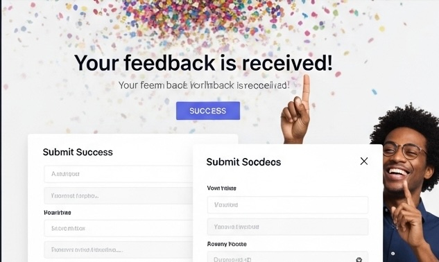
- Success and error messages: After submitting a form, a quick, happy checkmark animation or even a confetti burst can confirm success. If there's an error, a subtle shake of the input box or a brief red highlight draws your attention to the problem.
- New content alerts: In a chat app, when a new message comes in, it might subtly fade in or slide up, making it noticeable without being jarring.
Real Talk: When Should You Animate?
Ask yourself:
- Will this motion help someone understand what just happened?
- Does it make the interface easier to use or navigate?
- Can the animation reinforce a change in state or context?
If the answer is yes, it’s probably worth adding. If not, perhaps leave it out or at least test it with real users to see if it truly helps, not hinders.
TL;DR
Animation should support your users, not steal the spotlight. Used wisely, motion becomes a design tool not a design distraction.
If you’re wondering where to start, follow this principle:
Delight without disruption. Inform without intrusion.
Or, put another way: be helpful, not flashy.
Sources
- Nielsen Norman Group. (n.d.). Animation and UX. Retrieved from www.nngroup.com/articles/ui-animation/
- Google I/O. (2025). Explore: Technical Session 51. Retrieved from https://io.google/2025/explore/technical-session-51
- Reddit user. (2015, October 26). Examples of websites with way too much animation? [Online forum post]. Reddit. https://www.reddit.com/r/web_design/comments/3qaztu/examples_of_websites_with_way_too_much_animation/