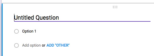
My dad used to tell a story of his brilliant lead programmer, Larry. He had gone dark for weeks to write the logic for some important calculation that was critical to the key project. Dad had to show progress. Lots of money had been spent and the client needed to see the magic happen. Larry declared himself "Done!" and sat my Dad down for a demo.
A clean black screen with a blinking cursor presented itself. Larry slowly and dramatically hit return. A moment later, the cursor spit out a number. That's was it.
Needless to say some context was added before they got on a plane with the floppies to fly off for the demo. I heard this story frequently as a kid when I wasn't finishing something completely or bothering to make my work understandable. It's a great software fable, but it's also interesting on a deeper level given the complexity of the forms I was building for him two decades later with Oracle's GUIs.
Lets take a step back...
In ye' olden days we still had much of the same data in life as we do now, and tracking it was still important. People have been record keeping for ages, and forms were mostly paper. Looking at those "original forms," you'll notice a distinct lack of cruft. You were often starting with blank stock so adding lots of lines and boxes would be extra work you'd have to repeat each time, or go through the expense to print custom. Alignment was used for meaning, so most of the stuff your eye was actually looking at on the page was the actual records custom data. Just the "value" in a name/value pair. We were taught you put your name in this corner, date in that corner, title on the top and voila - thats how you always start your term paper.
Think of a card from an old time card catalog. Every piece of data on here is strongly typed. Some are text with limits. Some are numbers or even select one from a list. This is real complex and important data, we used this to catalog the worlds knowledge before Google.
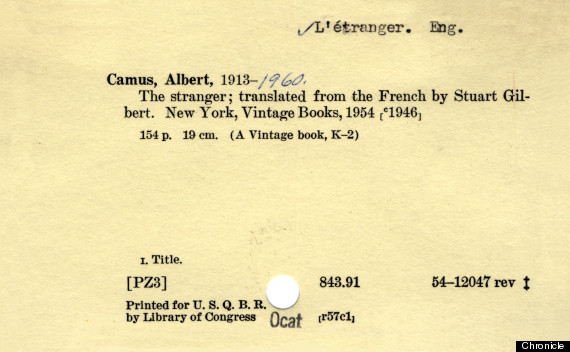
Look at how pretty that is.
You glance at it, and with a little training before hand, you know everything about that title. Your eye didn't have to read a single word or number that wasn't a specific value for that title.
Yes, you do need some training to use a card catalog. I remember having to do this type of exercise in a "library studies" class in school.
But that's okay. Youre a human at a library - youre expected to care a little. Once you understood how the system worked, you could quickly scan through a drawer in the catalog and find the title you were looking for. In a system where you had to flip through thousands of records to manually find what you needed, dropping the name labels evolved naturally.
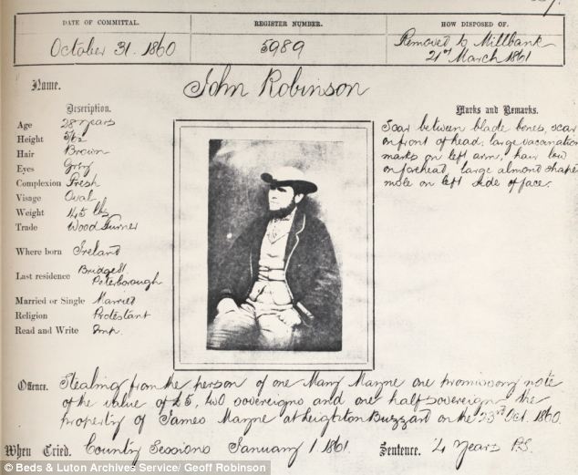
Check out one of the first mugshots ever. This 1850s form does have names for the data, but it's still a pretty clean layout. They don't bother with boxes around anything but the incarceration details.
Now I'm not arguing for card catalogs and log books. Relational databases are awesome and I'm proud of the work my Dad did in the 20th century and I do now. The benefits of being able to search and cross reference strongly typed data are obvious, but the benefit of having to use something like this all day escapes me.
Its not always this bad, but it is remarkable to me how complicated we make these things look when simple seemed to work just fine for a long time. In just the last 30 years or so we've created so much history around how data entry should work, I think we owe it ourselves to question a few assumptions that have emerged as we all just took the last persons approach as gospel:
They're "users."
No. They're people who have a job to do. It's not their job to USE your form. Your form helps them get their job done.
They need to know everything.
Nope. They need to enter the data they have, or find the data they were looking for - that is it. You needed to know everything to build it, and you loved doing that, so now you want to show them everything.
They can't scroll.
No one has ever burned a single calorie using a scrollbar, tab, or arrow key. Putting everything at the top has never made it feel simpler.
They won't know where to click.
Maybe they'll tab. Maybe they'll just start typing. Maybe they'll (gasp) just try clicking.
They won't see it.
The more stuff you make them look at, the less they will "see."
They're used to _____.
Stop selling people short. They're used to card catalogs, but today they're putting pictures of their cats in a cloud for fun. Help them, and theyll impress you.
They'll feel intimidated.
Absolute possibility. Change is scary, but often good.
Stepping back to now...
To date, forms have been an afterthought in concrete5. We grabbed Bootstrap's styling in version 5 and decided that looks good enough for us.
In-context editing was our big thing because it solved a real pain point for people. Teaching someone to use a backend and frontend felt unnatural. See a typo, fix a typo. With popping a page in edit mode in concrete5, we made something easy that used to be hard.
Now with version 8 we're taking on a problem just as hard. Building a data driven application is not the same as editing text on a page. The new features in Express let you quickly craft strongly typed data objects and relate them to one another. We want groups of people to be using concrete5 to manage powerful web presences driven with real data. They're going to be spending some real time in the dashboard entering data into forms.
We're working with clients who have hundreds of admins spending all day putting data into these things, so small improvements to efficiency have big rewards. We've done user research/testing, we've looked around at other solutions, and what we're seeing is an evolution towards a simpler flat almost "fieldless" form approach.

It's a little jarring the first time you see your old name/password login fields replaced by something different - but it's happening all around you none the less.
We know we don't have it quite right in the snapshot that is out now, but we're getting close.
Here's the new assumptions we are trying to replace the old ones with:
One thing at a time.
People pay accountants to interview them instead of having to look at a 1040 form. Asking one question per row is better than trying to stack everything important (or that will just fit) up at the top. It also makes responsive design very natural.
Since a lot of the forms we're building are extendable, keeping this "one attribute per row" approach helps with consistency for the site operator as their web presence grows as well. New stuff just gets inserted in the list, not spattered all over the place.
There should always be a line between each row. That line lets me know that question is over, and the next one is starting.
Sure, there are times where you might clump things like Date next to Time in a single attribute and single row. We're just saying don't throw "Color" up next to the Name field because you had a little extra room and it looked nice in a comp. If we can stick to the "one question per row" idea, you're having a much more subdued interaction - like an interview.
It's an interview.
The website/computer asks questions in small drop caps, the operator/human answers in mixed case and larger.
Don't yell rules all the time!
Let's show validation rules once you've broken them, not in tiny hard to read fonts everywhere before you've even started.
Keyboards are used - a lot.
Tab index MUST work perfectly. People (particularly old ones) tab through fields in a form. Using the mouse at all slows you down.
Focus!
If this person came to the form to enter some data, lets get that started right away.
With a few exceptions, the cursor SHOULD always focus to the first text field, particularly if there's no data in it yet.
A blinking cursor says a lot. These two examples feel like night and day, just because of the blinking line.

Buttons and links should look press-able.
These are actions you're going to take. It should feel like it.
Moving forward...
These are the ideas we're working with now, and while I know there's lots of corners to get figured out, we're already liking the results:
We'd love to have your help getting this right.
We totally understand the devil is in the details on this type of approach, and we know the snapshot from Friday the 13th of May isn't perfect yet.
We also don't believe it makes sense everywhere. Someone trying to fill out your contact form on your public website is in a very different place than someone who is doing data entry in the same system every day. Logging in should be super easy for everyone, there's not a lot going on there anyway. The solution should fit the problem.
We know we're going out on a limb a bit with one, but In-context editing was pretty far out there in 2003 too, and that worked out pretty well.
Come help us in github.