
Color theory sounds academic until you’re staring at a mockup that feels loud, muddy, or exhausting to use for eight hours a day. On the web, color is not decoration. It is structure, hierarchy, and accessibility all rolled into one.
If you really understand color theory, you don’t just know the terms. You can answer questions like:
- What should users notice first?
- What needs to stay calm for long reading or work sessions?
- What happens when this design scales to 50 pages, multiple contributors, and several devices?
Color theory for the web is less about memorizing the color wheel and more about restraint, contrast, and intent, especially once accessibility and editorial usability enter the picture.
Start With Purpose, Not Preference
The first mistake people make is starting with “colors I like.”
On the web, color choices should answer questions like:
- What needs attention first?
- What should feel clickable?
- What should fade into the background?
- What states need to be clearly distinct?
If every color competes for attention, nothing wins.
Good web palettes usually have:
- A neutral base (whites, grays, soft backgrounds)
- One primary brand color
- One or two supporting colors
- A small set of functional colors (success, warning, error)
Anything beyond that needs a very good reason.
- Contrast Is Not Optional
- On the web, contrast is usability.
- Text must be readable across screens, lighting conditions, and visual abilities. That means contrast ratios matter, whether or not you enjoy thinking about them.
Some practical truths:
- Light gray text on white backgrounds almost always fails
- Pure black on white is often too harsh for long reading
- Saturated colors lose readability when used for body text
Good designers adjust value (lightness) more than hue to improve contrast while keeping the palette intact.
If your color choices fail contrast checks, they are not “edgy.” They are broken.
Color Communicates Interaction
In interfaces, color teaches users how things work.
Users learn quickly:
- Blue things are links
- Bold, high-contrast elements are actionable
- Muted elements are secondary or disabled
If you break these expectations, you must replace them with something clearer, not just different.
A button should never look like body text. A warning should never look like a success message. Color consistency builds trust faster than cleverness ever will.
Quick Gut Check Before You Lock Anything In
Before finalizing a palette, ask yourself:
- What should users notice first?
- What needs to stay calm?
- What happens when this design scales?
If you can answer those confidently and defend your color choices without saying “it just felt right,” you’re doing color theory correctly on the web.
If you want, the next step could be mapping one of these palettes directly to Concrete branding, generating a 1920×1080 hero mockup prompt, or building a safe versus expressive decision chart for teams.
Color Palette Patterns That Work on the Web
Monochromatic
One hue. Multiple values. Clean and low-risk.
Example mockup:
- Entire site in slate blue
- Light blue-gray background
- Mid-tone sections for cards
- Dark navy text and headers
- Buttons use the same hue, just darker
Why it works:
- Nothing fights for attention
- Hierarchy comes from spacing, typography, and contrast, not color
- Feels calm, confident, and professional
Best for:
- CMS platforms
- Editorial tools
- Enterprise or government-adjacent sites
This palette quietly signals “we know what we’re doing.”

Analogous
Colors next to each other on the wheel. Calm and cohesive.
Example mockup:
- Blue to teal to green
- Header in deep blue
- Content sections in teal
- Subtle highlights in soft green
Why it works:
- Feels intentional without being loud
- Easy on the eyes
- Creates a natural visual flow
Watch out:
- Weak contrast can turn everything into visual mush
- Strong typography is required to maintain hierarchy
Best for:
- Wellness, education, and nonprofit sites
- Content-heavy experiences
- UX-first products
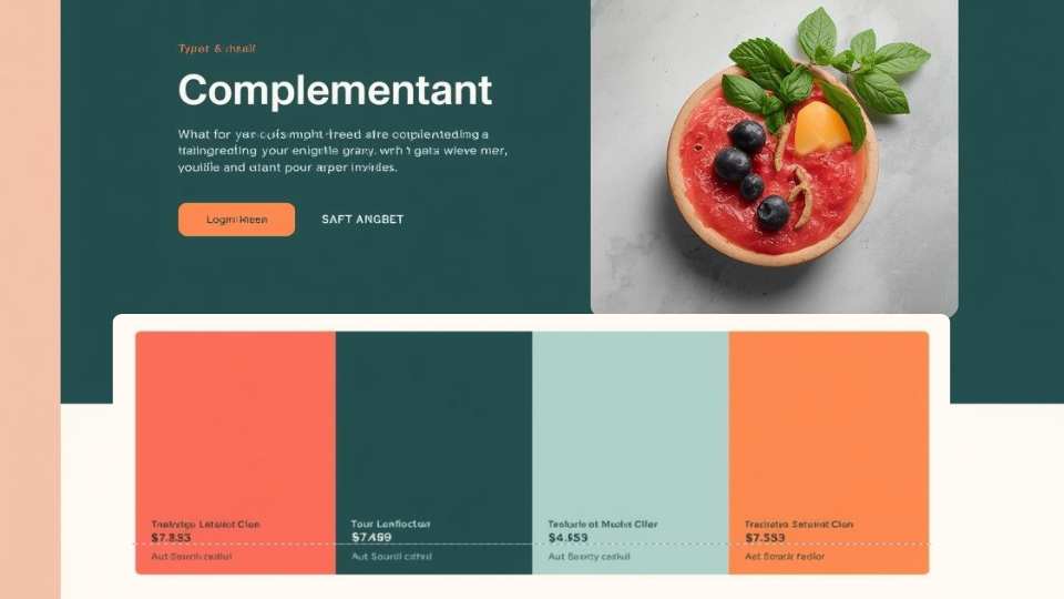
Complementary
Opposite colors. High contrast, high energy.
Example mockup:
- Deep blue base
- Bright orange calls to action
- White content background
Why it works:
- Buttons pop immediately
- Clear visual priority
- Feels dynamic and confident
Where people go wrong:
- Using both colors everywhere
- Turning the interface into visual whiplash
Best for:
- Marketing sites
- Conversion-focused pages
- Single-goal landing pages
Split Complementary
One base color plus two adjacent opposites. Forgiving but dynamic.
Example mockup:
- Base color: blue
- Accent colors: coral and yellow-green
- Neutral backgrounds keep it grounded
Why it works:
- Energy without chaos
- More flexible than pure complementary
- Easier to maintain consistency
Best for:
- Product marketing sites
- SaaS dashboards
- Brands that want personality without unnecessary risk

Triadic
Three evenly spaced colors. Balanced but tricky.
Example mockup:
- Blue for primary UI
- Red for alerts and emphasis
- Yellow for icons and highlights
Why it can work:
- Visually interesting
- Clear functional roles per color
Why it often fails:
- Too many “important” colors competing for attention
- Users don’t know where to look first
Best for:
- Educational tools
- Youth-focused brands
- Only when color roles are tightly controlled

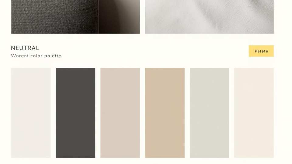
Neutral With Accent
Mostly grays or earth tones with one strong accent. The UI gold standard.
Example mockup:
- Gray and off-white foundation
- Black text
- One accent color used sparingly
Why it’s elite:
- Extremely readable
- Scales beautifully over time
- The accent color becomes meaningful, not decorative
Best for:
- CMS interfaces
- Admin dashboards
- Long-session tools
- Anything people use daily
The Color Wheel (Why It Still Matters)
The color wheel is not just a beginner tool. It helps you:
- Understand relationships between colors
- Predict harmony and contrast
- Build intentional palettes instead of guessing
Even advanced designers mentally reference it, whether they admit it or not.
Use the Color Wheel, But Don’t Worship It
The color wheel helps you understand relationships, not dictate outcomes.
Analogous palettes work well for content-heavy sites because they reduce visual tension. Complementary palettes are powerful for calls to action, but exhausting if overused.
For most websites:
- Analogous or neutral-heavy palettes scale better
- High-contrast complements are best reserved for CTAs and alerts
- Monochromatic palettes need strong typography to avoid feeling flat
Color theory helps you predict behavior, not choose final hex codes.
Saturation Is Where Most Web Palettes Fail
Highly saturated colors look great in small doses and terrible in large ones.
On the web:
- Saturation increases visual fatigue
- Bright colors feel louder on screens than in print
- Large saturated areas make interfaces feel aggressive
Most successful web palettes use muted versions of brand colors and reserve full saturation for highlights or interactions.
If everything is loud, nothing is important.
Think in Systems, Not Pages
Web color choices should be designed as a system, not a single screen.
Ask:
- How does this color work across headers, buttons, alerts, and forms?
- Does it still work in dark mode?
- What happens when content editors introduce new elements?
A color system should survive growth, inconsistency, and real-world use. If it only works on the homepage mockup, it’s not ready.
Accessibility Is Part of Good Design, Not a Constraint
Accessible color choices help everyone.
High contrast improves readability in sunlight. Clear state colors reduce cognitive load. Consistent color usage makes interfaces easier to learn. Accessibility is not about watering down design. It’s about removing unnecessary friction.
Designs that meet accessibility standards almost always feel more confident and intentional.
Some color combinations simply do not work for a large portion of users. Color vision deficiencies, low-contrast environments, aging screens, and bright daylight all affect how colors are perceived.
Before committing to any palette, it’s worth understanding which colors are harder to see and why inclusive palettes matter:
- What colors are hard to see for color blind people
- Inclusive website color palettes for accessibility
Accessibility is not a constraint. It’s a forcing function that leads to clearer, more confident design decisions.
Choosing colors for the web is not the same as choosing colors for a poster, a logo, or a mood board. On the web, color has a job. Several jobs, actually.
It has to look good, yes. But it also has to load fast, scale across devices, meet accessibility standards, and guide users without overwhelming them. That’s where color theory stops being abstract and starts being useful.
Let’s talk about what really matters when you’re choosing colors for websites and interfaces.
How You Know You’ve Chosen Well
You’ve chosen good web colors when:
- Users don’t comment on them, they just use the site
- Editors can add content without breaking the layout
- Buttons are obvious without labels
- The palette works on mobile, desktop, and low-quality screens
- You can explain every color choice out loud
If you can defend your colors with clarity instead of “it felt right,” you understand color theory on the web.
Final Thought
Color on the web is not decoration. It’s communication.
When you choose colors intentionally, you reduce confusion, speed up interaction, and make your design feel calm instead of chaotic.
And yes, it still looks good.