
We spend a lot of time talking about user experience. We audit it, test it, optimize it. We obsess over page load times, click-through rates, and mobile responsiveness. But there’s one experience that consistently gets ignored.
The editorial experience.
Most teams pour resources into making the frontend feel smooth and intuitive, while the backend remains a clunky mess. Editors are expected to keep content fresh, accurate, and on-brand, but they’re often handed a system that works against them.
The result isn’t just internal frustration. It’s lower-quality content, slower publishing cycles, and a morale problem that spreads across departments.
If your CMS makes your team’s job harder instead of easier, it’s not just a tool problem. It’s a UX problem.
What Editorial UX Actually Means
Editorial UX is the experience of the people who work inside the CMS. These are the folks creating pages, managing media, updating metadata, scheduling posts, and making sure the live site reflects what’s actually happening in the organization.
Editorial UX includes:
- How content is structured and accessed
- How workflows move from draft to review to publish
- How intuitive the editing interface feels
- How easily editors can preview, revert, and update content
- How clearly the system communicates errors, warnings, and success states
This is not about making the admin panel pretty. It’s about making it usable, reliable, and empowering for the people who rely on it every day.
What Bad Editorial UX Costs You
Poor backend UX is expensive. Not in dollars spent, but in time, frustration, and lost opportunity.
1. Publishing delays
When editors can’t find what they need, or have to wait on developers to make simple changes, deadlines slip. New content takes longer to produce. Campaigns get stuck in draft mode. Updates go live after they’re relevant.
2. Content quality drops
If every task feels like a hassle, people start cutting corners. Formatting gets skipped. Old content gets reused instead of refreshed. Outdated pages stay live because updating them feels like a fight.
3. Morale suffers
No one enjoys working in a system that feels broken. Editors start to internalize the frustration and assume they’re the problem, when it’s really the tools. Over time, this leads to burnout, turnover, and quiet resistance to using the CMS at all.
4. Developer time is wasted
When non-technical users can’t confidently use the CMS, every update turns into a ticket. Developers get pulled into basic content changes they shouldn’t be handling. Real feature work slows down and everyone gets frustrated.
Signs Your Editorial UX Is Failing
You don’t need a formal audit to spot backend UX issues. Just listen to your editors.
- “I don’t know where that content lives.”
- “I’m afraid to click that.”
- “Can someone else just publish it?”
- “Why do I have to update this in three places?”
- “It’s easier to paste the update into Slack and ask someone else.”
If any of these sound familiar, your CMS is not supporting the way your team actually works.
Common UX Issues Inside the CMS
Overloaded dashboards
Trying to cram everything into one screen overwhelms editors and makes it harder to focus. Important tasks get buried under noise.
Hidden settings and buried fields
When basic options live inside advanced panels or five layers deep, editors miss them or make mistakes.
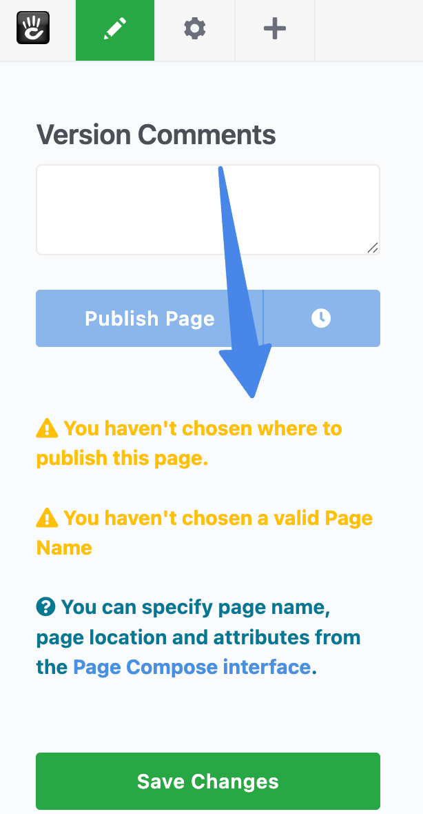
Unclear status indicators
If you can’t tell at a glance whether a page is a draft, published, or scheduled, time gets wasted asking questions or fixing accidents.
Inconsistent terminology
One area calls them “Blocks,” another calls them “Widgets,” and a third says “Modules.” They all do the same thing. Language matters, especially for onboarding.
Lack of feedback
Editors need confirmation. Did it save? Did it publish? Did something fail? Silent errors destroy trust quickly.
What Good Editorial UX Looks Like
Improving backend UX does not require a full redesign. Small, intentional changes go a long way.
Consistent language and actions
Use familiar terms. Make buttons predictable. If “Save” behaves differently on every screen, confusion spreads fast.
Clarity in navigation
Editors should always know where they are, what they’re editing, and how to get back. Fewer clicks matter. See how intuitive page creation should feel.
Focused interfaces
Show only what’s relevant to the task at hand. Hide developer-only settings from editorial views.
Logical workflows
Draft, review, approve, publish. This should feel obvious and not require tribal knowledge to navigate.
Editor onboarding
A first-time user should be able to log in, create a page, and preview it without reading a manual.
Helpful error handling
Don’t just say something failed. Explain what went wrong and how to fix it.
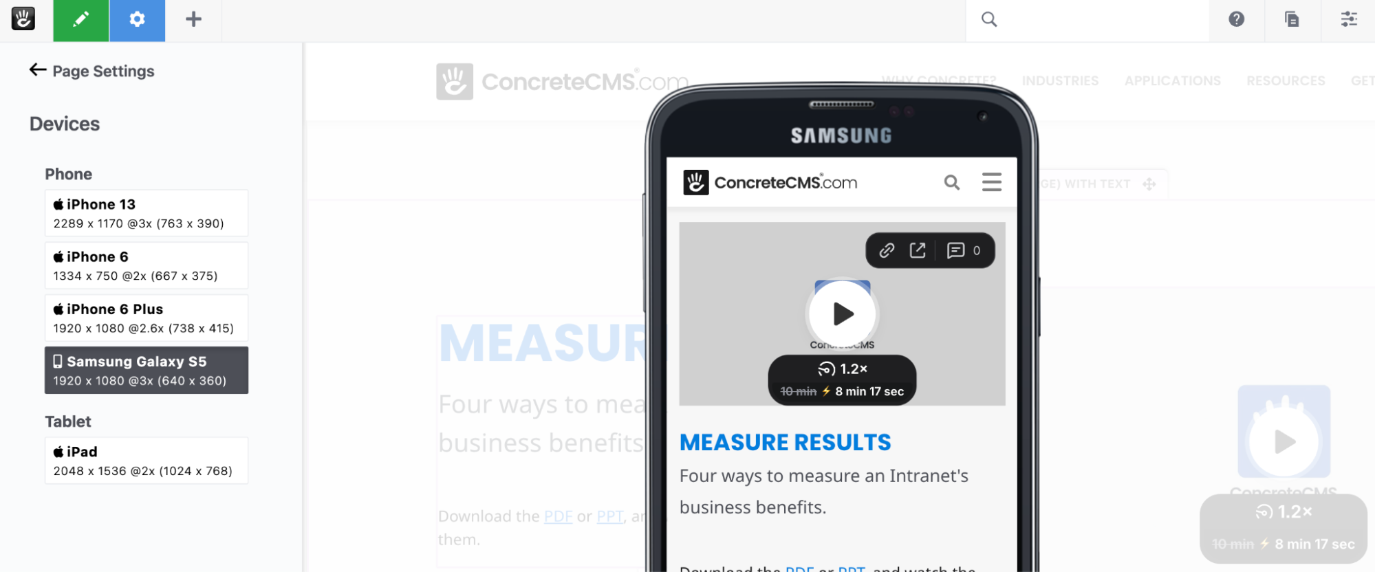
Visual previews
Let editors see how content will look before publishing. Even better if they can preview desktop and mobile views.
How to Start Fixing Your Editorial Experience
Talk to your editors
Ask what’s frustrating. Sit with them while they work. Watch where they hesitate or backtrack. Those moments tell you everything.
Document the real workflow
Not the ideal one. The one people actually use. Map it out and you’ll quickly see where friction lives.
Start small
Fix one pain point at a time. Add a status label. Simplify a form. Improve help text. Small wins compound.
Involve editors early
Don’t wait until launch to get feedback. Let editors test prototypes. Design with them, not just for them.
Your Editors Deserve Better
Your editors are your power users. They keep your site accurate, your content relevant, and your brand consistent. Yet they’re often the last people considered during redesigns or CMS rollouts.
That needs to change.
Improving editorial UX speeds up publishing, improves content quality, reduces developer dependency, and makes teams happier.
The best CMS experience isn’t just what your users see. It’s what your editors feel when they use it.
Want a CMS audit focused on backend usability, or help designing a publishing workflow your team won’t hate? Let’s talk.