Most teams have more dashboards than they have decisions. Someone built a beautiful view six months ago, it gets shared in a weekly email, everyone nods at it, and nothing changes. That is not a KPI dashboard. That is a report with better formatting.
A real KPI dashboard is built around action. Every number on it should connect to a goal, have an owner, and trigger a response when it moves. This guide covers what a KPI dashboard is, what belongs on one, how to build it, and what KPI dashboard examples look like for different teams.
Jump to the section most relevant to you:
- What Is a KPI Dashboard?
- What Are the Four Main KPIs?
- How to Build a KPI Dashboard
- KPI Dashboard Examples by Team
- Tools and Templates
What Is a KPI Dashboard?
A KPI dashboard is a visual display of your most important key performance indicators, updated regularly and organized so that the people who need to act on the data can read it at a glance. The emphasis is on "most important." A dashboard is not a database. It is a curated view of the metrics that matter most right now, for a specific team, against a specific set of goals.
The difference between a KPI dashboard and a general analytics report comes down to intent. A report answers "what happened?" A dashboard answers "what do we need to do about it?" If you look at a dashboard and your first reaction is to export the data for further analysis, the dashboard is not doing its job.
Good KPI dashboards share a few traits:
- They show only the metrics that connect to active goals, not everything available
- They display current performance against a target or baseline, not just raw numbers
- They are reviewed on a consistent schedule by people with the authority to act
- They are owned by a person or team, not just "the system"
For a deeper look at how to choose which metrics belong on a dashboard in the first place, the Digital Business KPI Playbook covers that process in detail.
What Are the Four Main KPIs?
KPIs are easier to choose when you understand what type of measurement you actually need. Most business KPIs fall into one of four analytical categories, and a well-built dashboard should have representation across all of them.
Quantitative KPIs are numeric and straightforward: leads generated, pages published, support tickets resolved. They are the easiest to track but the easiest to misread. Volume without context tells you activity is happening, not that it is working.
Qualitative KPIs measure how well something is happening rather than how much. Satisfaction scores, error rates, conversion rates, and quality of hire all fall here. These are harder to collect but far more connected to real outcomes.
Leading KPIs are forward-looking. They predict future performance based on current behavior. Employee Net Promoter Score, pipeline coverage, and onboarding completion rates are all leading indicators. They give you time to act before a problem becomes a result.
Lagging KPIs measure what already happened: revenue, turnover rate, customer churn. They confirm whether your strategy worked, but they do not give you much warning. A dashboard that only shows lagging indicators is always telling you about the past.
The most useful dashboards mix all four. If yours is heavy on quantitative and lagging metrics, you are mostly looking backwards at activity. Add some qualitative and leading indicators and you will start to see what is actually coming.
Try it free
See what Concrete CMS can do for your team
No setup headaches. No commitment. Just the real platform.
How to Build a KPI Dashboard
Building a KPI dashboard is less about the tool you use and more about the decisions you make before you open it. The most common mistake is starting with the data and working backwards. Start with the questions instead.
Step 1: Define the decisions the dashboard needs to support
Before picking a single metric, write down the three to five questions the people who will use this dashboard need to answer on a regular basis. For an HR team it might be: Are we filling roles fast enough? Are new hires staying? Is the intranet reducing direct HR requests? Every metric on the dashboard should connect to one of those questions.
Step 2: Keep the metric count small
Resist the urge to include everything. A dashboard with 20 metrics is just a spreadsheet with a better color scheme. Pick the fewest metrics that give you complete coverage of your key questions. For most teams that is somewhere between three and seven. If a metric moving would not change anything your team does, it does not belong on the dashboard. The KPI Examples for Every Team post has practical starting points by function if you need help narrowing it down.
Step 3: Set a baseline and a target for each metric
A number without context is just a number. Every KPI on your dashboard needs a baseline (what normal looks like) and a target (what good looks like). Without those, you cannot tell whether a result is worth celebrating or investigating.
Step 4: Assign an owner to each metric
Every KPI on the dashboard should have a name next to it. Not a team, a person. If a metric drops and everyone looks at each other, the dashboard is not working. Ownership creates accountability without requiring a meeting to establish it.
Step 5: Set a review cadence and stick to it
Weekly for fast-moving metrics like sales pipeline or content publishing. Monthly for slower-moving ones like turnover or NPS. The cadence matters less than the consistency. A dashboard reviewed irregularly becomes background noise.
Step 6: Treat it as a living document
Business goals change. Quarters turn over. A metric that mattered six months ago may not matter today. Schedule a quarterly review of the dashboard itself, not just the numbers on it, to make sure it is still asking the right questions.
KPI Dashboard Examples by Team
The right KPI dashboard looks different depending on who is using it and what decisions they need to make. Here are four examples organized by team type.
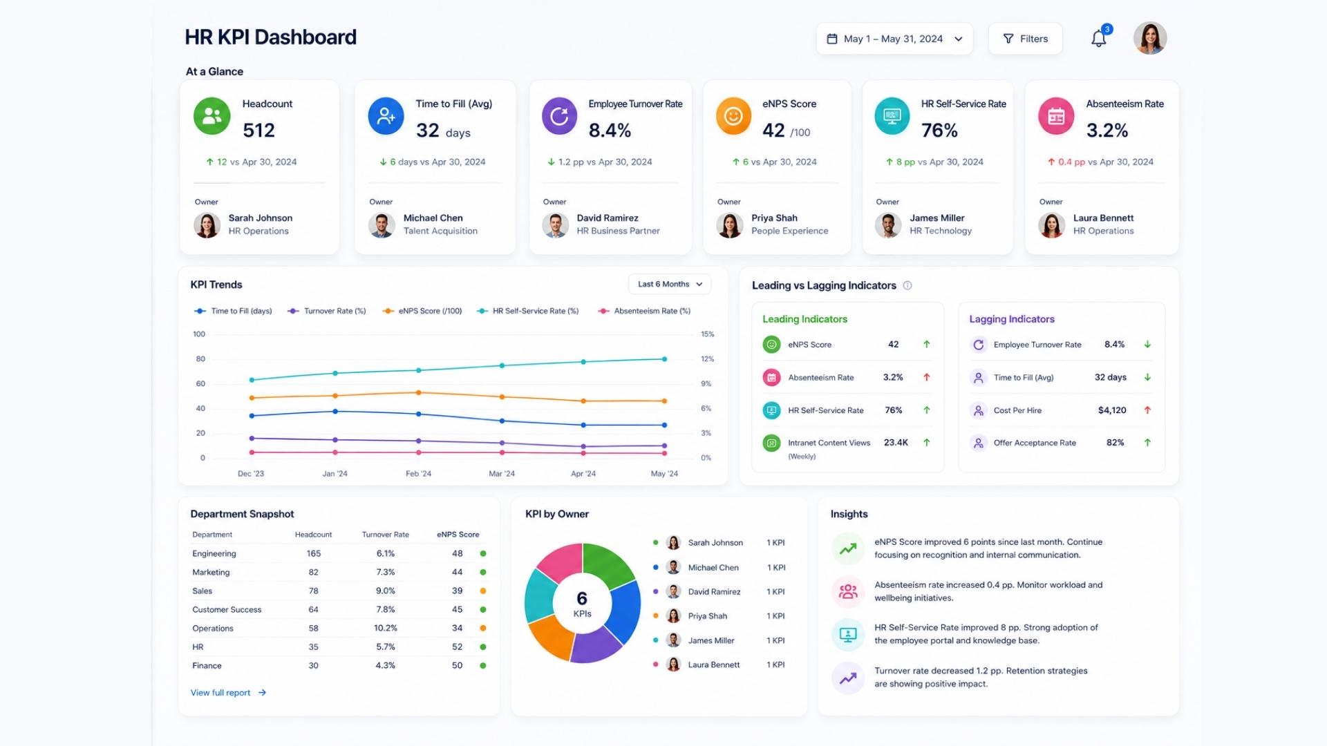
HR KPI Dashboard
An HR KPI dashboard should give HR managers and department heads a clear view of workforce health at a glance. Core metrics to include:
- Time to fill (by department)
- 90-day retention rate
- Voluntary turnover rate
- Employee Net Promoter Score (eNPS)
- Onboarding task completion rate
- HR self-service rate
The self-service rate is particularly worth watching for teams managing an intranet or HR portal. A low number usually points to a content or navigation problem, not an employee behavior problem. For more on what to track in HR specifically, the HR KPI Examples post goes deeper on each of these.
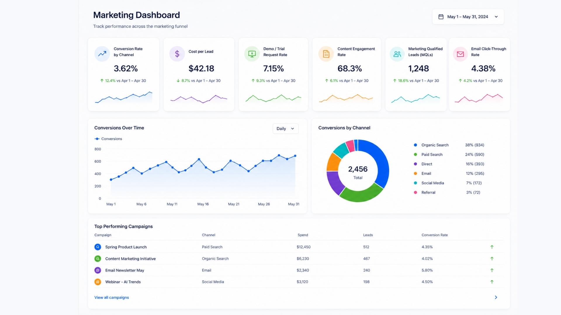
Marketing KPI Dashboard
A marketing KPI dashboard should connect top-of-funnel activity to bottom-of-funnel outcomes. The mistake most marketing dashboards make is showing traffic and impressions without showing what those visits produced. Core metrics to include:
- Conversion rate by channel
- Cost per lead
- Demo or trial request rate
- Content engagement rate (time on page, scroll depth)
- Marketing qualified leads (MQLs) generated
- Email click-through rate
The most important metric on any marketing dashboard is the one closest to revenue. Everything else supports it.
Executive KPI Dashboard
An executive KPI dashboard needs to be the most ruthlessly edited of all. Leadership does not need to see every department metric. They need to see whether the business is healthy and which areas need attention. Core metrics to include:
- Revenue vs. target (current period and trailing)
- Customer retention or churn rate
- Employee turnover rate
- Net Promoter Score (customer-facing)
- Key operational metric (specific to the business model)
- Pipeline coverage
The best executive dashboards are ones where any metric in the red triggers an immediate, obvious next step. If a red number just prompts a meeting to figure out what to do, the dashboard is missing the context it needs.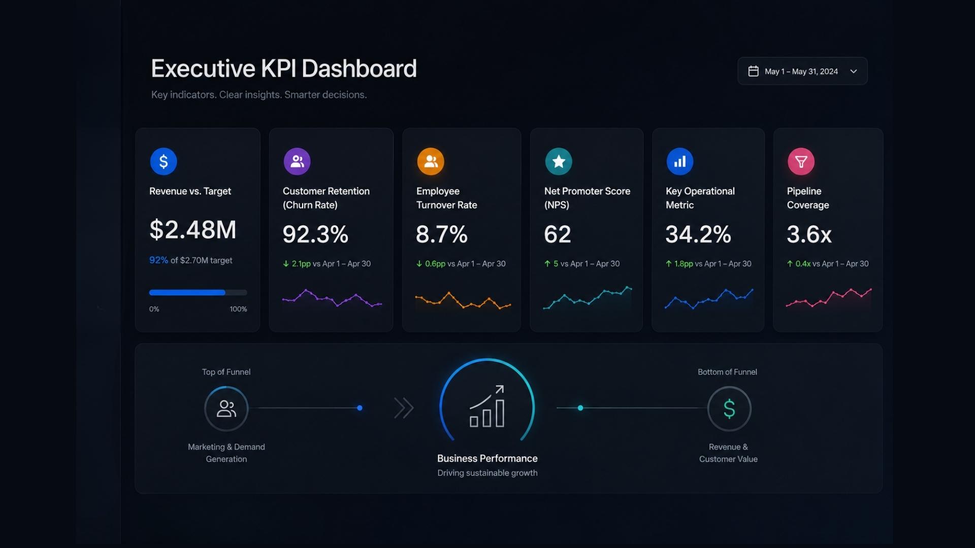
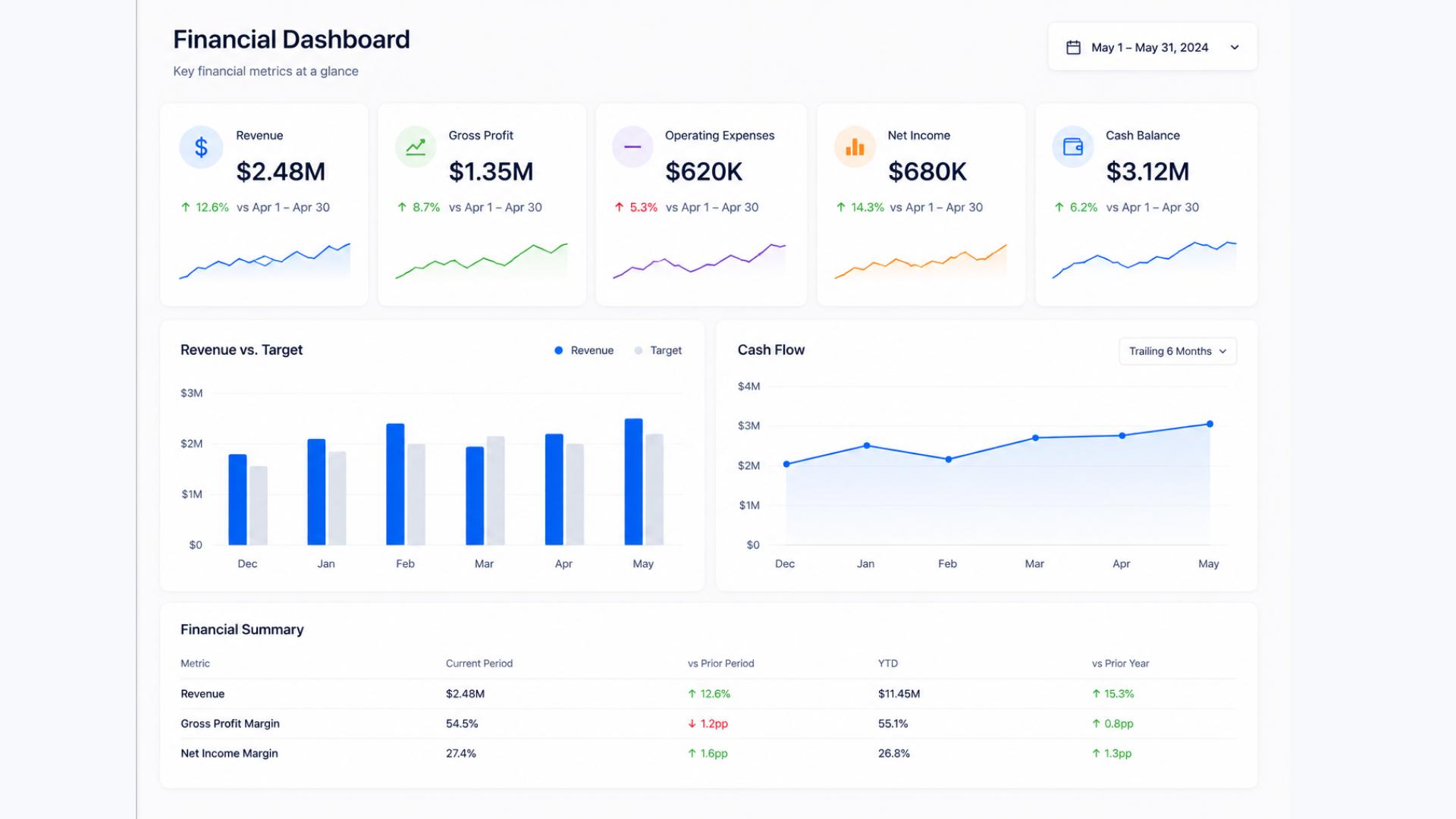
Financial KPI Dashboard
A financial KPI dashboard serves both internal decision-making and, for many organizations, compliance and reporting requirements. The metrics need to be accurate, current, and easy to trace back to source data. Core metrics to include:
- Revenue vs. budget (monthly and year-to-date)
- Gross margin
- Operating expenses vs. budget
- Accounts receivable aging
- Cash flow (operating)
- Cost of acquisition (if applicable)
For professional services firms and compliance-heavy organizations, the financial dashboard often needs to serve multiple audiences: internal management, auditors, and executive leadership. Keeping the layers clearly separated, one view per audience, is usually better than trying to build a single dashboard that serves everyone.
Tools and Templates
The tool matters less than the discipline around it. A well-maintained spreadsheet reviewed weekly beats a sophisticated BI platform nobody looks at.
For most teams starting out, a KPI dashboard in Excel or Google Sheets is perfectly adequate. The KPI dashboard Excel template approach works well because it forces you to be deliberate about what you include, there is no auto-populate temptation, and it is easy to share across a team without software licenses.
For teams that need live data, tools like Google Looker Studio (free), Power BI, or Tableau connect directly to your data sources and update automatically. These are worth the investment once you have discipline around which metrics belong on the dashboard, not before.
For digital and content teams, your CMS plays a role here too. A platform that makes it easy to see what is published, what is performing, and what is in the queue directly affects the metrics on your marketing and content dashboards. If pulling that data requires a developer request every time, it creates a lag that makes the dashboard less useful.
Start simple. Define your questions, pick your metrics, set your baselines, assign owners, and review consistently. That process, done with any tool, will tell you more than a sophisticated dashboard nobody has the discipline to maintain.
See It in Action
Concrete CMS gives content and digital teams the publishing speed and workflow visibility that feeds directly into the KPIs on your dashboard. Permissions, approvals, and content management built in from the start.