
Most intranet home pages are built once, celebrated at launch, and then quietly abandoned. Someone puts together a nice design, leadership approves it, the IT team deploys it, and six months later the news section is still showing the same three announcements from last quarter. Employees notice. They stop checking. Eventually they stop logging in at all.
See how easy it is to manage an intranet home page Try Concrete CMS free and edit your first page in minutes, no developer needed.
Start a Free Demo →
This isn't a design problem. It's a governance and editing problem, and the two are more connected than most organizations realize. A home page that requires IT involvement every time someone wants to update a headline will always go stale. A home page that any trained editor can update in two minutes stands a much better chance of staying useful.
This guide covers what actually belongs on an intranet home page, what the research says about what employees actually use, the design principles that hold up over time, and the mistakes that are almost universal. We'll also look at what happens when you get it right, using BASF as a real-world example.
What Is an Intranet Home Page?
The intranet home page is the first screen an employee sees after logging in. It's the front door, the navigation anchor, and the primary signal of whether the intranet is maintained or not. Employees make a judgment call about the entire platform in the first few seconds based on what they see here. If the home page looks stale, they assume everything else is too.
That makes the home page uniquely high-stakes. It sets the tone for the whole experience. A well-designed, well-maintained home page pulls employees in. A neglected one trains them to bypass the intranet entirely and ask someone on Teams instead.
Why the Home Page Makes or Breaks Your Intranet
The numbers on intranet adoption are not encouraging. 72% of employees rate their intranet tools as fair to poor, 57% say they see no purpose in their company intranet, and 31% never log in at all. Those figures aren't primarily about the back-end platform - they're about what employees encounter when they show up. And what they encounter first is the home page.
Employees spend an average of 3.2 hours per week searching for information they can't easily find. A well-designed intranet home page with prominent search and clear navigation cuts that number significantly.
There's also a trust dimension that's easy to overlook. When an employee visits the home page and sees an announcement from eight months ago sitting at the top, they learn something important: nobody is taking care of this. That perception spreads. Once employees stop trusting the intranet as a source of current information, it's very hard to win them back.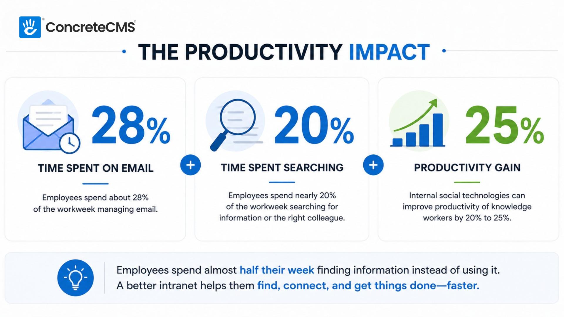
The flip side is also true. An intranet home page that's obviously fresh, easy to navigate, and genuinely useful builds a habit. Employees start logging in because they've learned that useful things are there. That flywheel, once it starts turning, is much easier to maintain than it was to start.
What Should Be on an Intranet Home Page?
There's no single right answer, because the right home page depends on what your employees actually need. An HR portal home page looks different from a communication-focused intranet for a large enterprise. That said, certain elements earn their place almost universally.
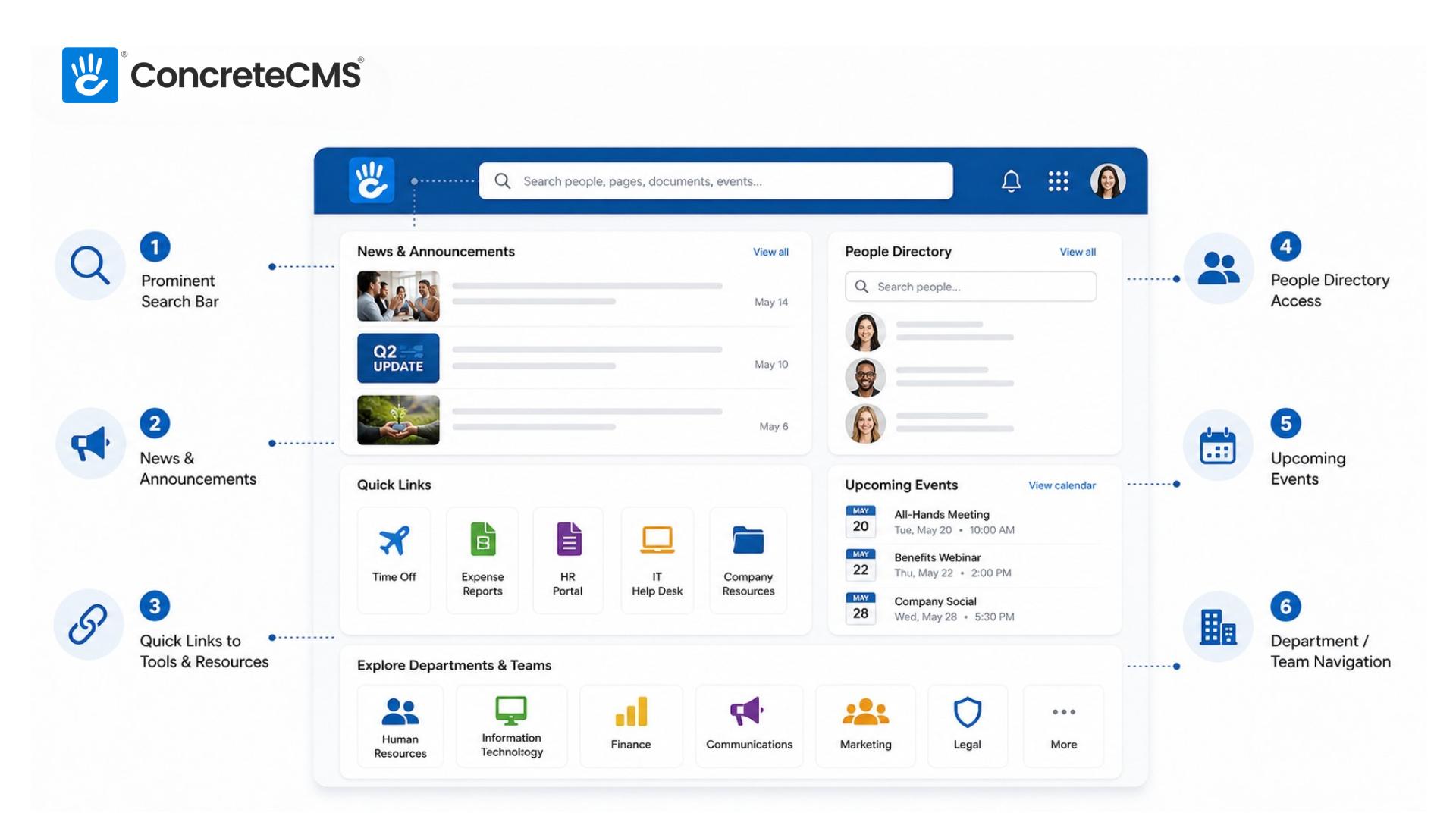
A prominent search bar
Search is how most employees navigate an intranet once it gets past a certain size. Burying the search bar in a corner or making it hard to find is one of the most common and most costly mistakes on an intranet home page. It should be visible immediately, ideally above the fold, and it should search across all content types: pages, documents, people, and events, not just news articles.
Current news and announcements
This is the section most likely to go stale, and the one employees check most often. Three to five recent items is the right range. More than that and it becomes overwhelming; fewer than that and it looks like nothing is happening. The key word is current - anything older than a few weeks should move to an archive, not sit on the home page.
Quick links to the most-used tools and resources
Most employees visit the intranet to accomplish a specific task: submit a time-off request, find the expense report template, look up the holiday schedule. Quick links that surface the highest-traffic destinations cut down the number of clicks between login and task completion. Use your analytics to figure out what those destinations actually are rather than guessing, and revisit the list every quarter.
People directory access
In organizations of any real size, employees frequently need to find out who to contact about something. A search or browse interface for the people directory belongs near the top of the home page. Ideally it includes photos, titles, and department. In distributed and hybrid organizations this is especially valuable, because the informal "I'll just ask the person next to me" option doesn't exist.
Upcoming events
A calendar or event feed showing the next two to four weeks of company-wide or relevant events gives employees a sense of what's coming. All-hands meetings, deadlines, training sessions, company social events - these belong on the home page. Keep the feed focused on what's actually upcoming rather than showing a full calendar that requires scrolling.
Department or team hub navigation
For larger organizations with multiple departments, the home page needs to make it easy to get to the right section of the intranet quickly. Clear navigation tiles or a well-organized menu that surfaces HR, IT, Finance, Communications, and other departments lets employees drill into what's relevant to them without wandering.
Intranet Home Page Design Best Practices
Good design on an intranet home page is less about aesthetics and more about information hierarchy. The real question is whether an employee can find what they need in under ten seconds.
Design for the employee, not for leadership
This is the single most important principle, and the one most frequently violated. Home pages designed to impress executives end up featuring large hero images of the CEO, prominent branding elements, and mission statement copy that nobody reads. Home pages designed for employees feature search, quick links, and current news. These are not the same thing, and when there's a conflict between them, employee needs should win. An intranet nobody uses impresses nobody.
Prioritize scannability over density
Employees spend seconds on the home page, not minutes. They're scanning for one of two things: something new they should know about, or the thing they came here to find. Dense walls of text, complex navigation structures, and pages that require scrolling to find anything useful all work against this. Clear visual hierarchy, distinct content sections, and generous whitespace make scanning faster and more reliable.
Mobile matters more than most organizations expect
Even in desk-based organizations, employees increasingly access intranets from phones, particularly for time-sensitive things like checking an announcement before a meeting or looking up a colleague's number. If the home page breaks on mobile or requires horizontal scrolling, a significant chunk of your audience is having a bad experience. Test on actual devices, not just a browser window that's been resized.
Personalization is worth the investment
Not everyone needs the same home page. A sales manager in Chicago and a warehouse team member in Phoenix have different information needs. Role-based or location-based personalization meaningfully increases the likelihood that the home page feels useful rather than generic. Surfacing relevant news, links, and resources for each user's context is what makes the difference. Most enterprise intranet platforms, including Concrete CMS, support this natively. If you're currently using SharePoint, it's worth understanding where it falls short on personalization and editor experience.
Keep the above-the-fold experience focused
Everything that tries to be important on the home page ends up being nothing. If every department gets a featured section, no section feels important. Choose what belongs in prime real estate. Search, breaking news, and three or four quick links are good candidates. Let everything else live below the fold or in navigation. Ruthless prioritization makes the home page more useful, not less complete.
Common Mistakes to Avoid
Most intranet home page failures are predictable. The same patterns show up across organizations of all sizes and industries.
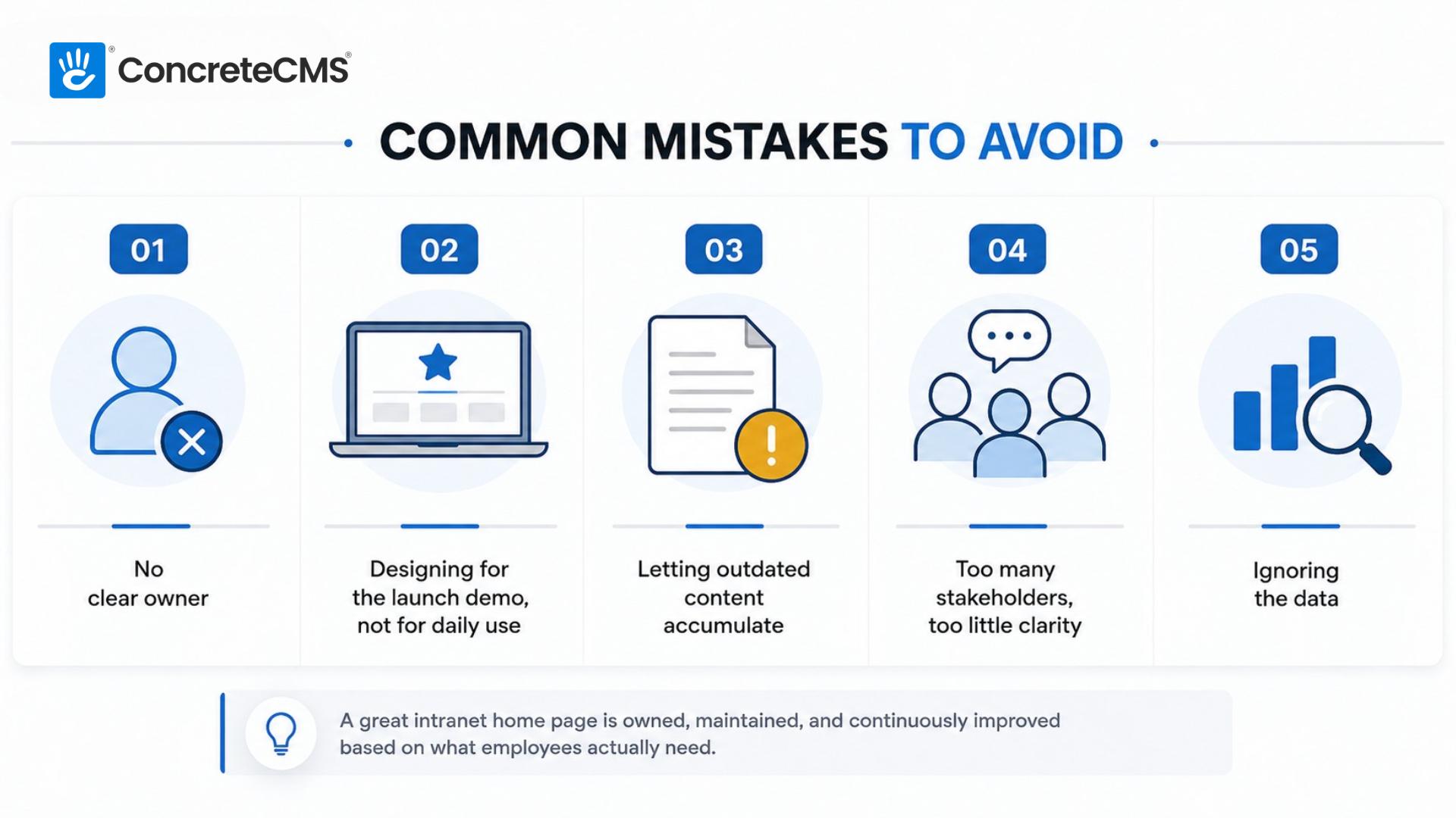
Mistake 01
No clear owner.
The home page that belongs to everyone belongs to no one. Without a named person or team responsible for keeping it current, it will deteriorate. This is an accountability problem, not a technology problem. Assign ownership before launch, not after things go wrong.
No clear owner.
The home page that belongs to everyone belongs to no one. Without a named person or team responsible for keeping it current, it will deteriorate. This is an accountability problem, not a technology problem. Assign ownership before launch, not after things go wrong.
Mistake 02
Designing for the launch demo, not for daily use.
A home page that looks impressive in a presentation can be a nightmare to maintain in practice. Complex layouts with many content zones require many content owners. If the editing process is laborious, updates will be infrequent, and the home page will age visibly.
Mistake 03
Letting outdated content accumulate.
This is the content rot problem, and it compounds. One stale announcement trains employees to ignore the news section. A dozen stale announcements teach them that the whole intranet cannot be trusted. Set expiry dates on time-sensitive content from day one.
Letting outdated content accumulate.
This is the content rot problem, and it compounds. One stale announcement trains employees to ignore the news section. A dozen stale announcements teach them that the whole intranet cannot be trusted. Set expiry dates on time-sensitive content from day one.
Mistake 04
Too many stakeholders, too little clarity.
Every department wants a slice of the home page. The result is a cluttered page where nothing is findable and everyone's priorities cancel each other out. A single person or small team needs editorial authority over the home page. Stakeholder input is welcome; stakeholder veto is not.
Mistake 05
Ignoring the data.
Most intranet platforms provide analytics on what employees click, search for, and where they go after the home page. That data is a direct line into what your employees actually need versus what you assumed they needed. Revisit it quarterly and adjust the home page accordingly.
Ignoring the data.
Most intranet platforms provide analytics on what employees click, search for, and where they go after the home page. That data is a direct line into what your employees actually need versus what you assumed they needed. Revisit it quarterly and adjust the home page accordingly.
Intranet Home Page in Practice: The BASF Example
BASF is the largest chemical producer in the world, with over 100,000 employees across 80 countries and 390 production sites. Internal communications at that scale is a genuine logistical challenge. The North American BASF group had been running an intranet built on purpose-built software, but the editing experience for authors was poor and the reading experience for employees wasn't much better. Content was going stale because updating it was too much work.
PortlandLabs rebuilt the BASF intranet on Concrete CMS, creating a platform where department-specific subdomains could each maintain their own color palette within the company style guide, giving each team a distinct look while keeping everything recognizably BASF. SSO integration meant employees authenticated with their existing employee cards. ISO:27001 certification and SOC 2 Type 2 compliance covered the security requirements for a company handling that much sensitive information.

Because the system is a pleasure to use for our authors, our content is fresher.
Stefan Glut
Online Communications Officer, BASF Corporation
That quote from Stefan Glut is worth sitting with. He didn't say the intranet was more powerful or more feature-rich. He said it was a pleasure to use for authors, and because of that, the content is fresher. The causal chain is simple: easier editing leads to more frequent updates, which leads to a home page employees can trust. The design, the navigation, the structure all depend on that chain staying intact.
How to Keep Your Home Page Fresh
The governance conversation is less exciting than the design conversation, but it determines whether any of the above holds up past the first few months. A beautiful home page with no governance plan will look worse at six months than a plain one that's actively maintained.
Assign a home page owner before launch. This should be a real person with the authority to make editorial decisions and the responsibility to keep things current. This person doesn't need to be technical. On Concrete CMS, editing the home page is in-context: you see the page, you click what you want to change, you update it, you publish. No backend. No ticket to IT. That friction reduction is what makes regular maintenance realistic rather than aspirational.
Set a review cadence and stick to it. The news section should be reviewed weekly. Quick links should be audited quarterly using click data. The overall layout and content structure should be evaluated every six months against actual usage data. None of this takes long when the editing experience is fast. It takes long when every update requires a developer.
Use your analytics as a governance tool, not just a reporting tool. If employees are repeatedly searching for something that isn't surfaced on the home page, add it. If a quick link nobody clicks is taking up space, remove it. The home page should evolve to match how employees actually use the intranet, not how you imagined they would at launch.
How Concrete CMS Makes This Easier
Most of the home page problems described in this post have a common root: the people responsible for keeping content current don't have an easy way to do it. They're either waiting on IT, navigating a clunky backend interface, or doing it so infrequently that they've forgotten how it works. The result is a home page that's visibly behind, and employees who've learned to distrust it.
Concrete CMS was built around in-context editing from the start. The person maintaining the home page sees exactly what employees see, clicks what they want to change, makes the update, and publishes. There's no separate admin interface to navigate, no CMS-specific vocabulary to learn. BASF's Stefan Glut described the effect directly: authors find it a pleasure to use, so the content stays fresh.
Beyond the editing experience, Concrete's built-in permissions system means you can give department heads control over their section of the home page without giving them access to everything else. Workflow tools let you route updates through an approval process if your organization requires it. Multisite support means a large organization can maintain distinct home pages for different business units while keeping everything on the same platform.
For compliance-heavy organizations, the platform is MIT-licensed and fully auditable. Your security team can review the code. Your IT team can choose where it's hosted. There are no black boxes.
FAQ
What should an intranet home page include?
At minimum: a prominent search bar, a current news or announcements section, quick links to the most-used tools and resources, people directory access, and upcoming events. The specific mix depends on your organization's primary use case. An HR portal home page will look different from a communications-focused one, but those five elements appear on almost every effective intranet home page.
How often should an intranet home page be updated?
The news section should be reviewed at least weekly. Quick links should be audited quarterly. The overall structure and layout should be evaluated every six months using analytics data. If updating any of these requires IT involvement, that's a signal that your platform is creating unnecessary friction, and that friction is why content goes stale.
Who should own the intranet home page?
A named person or small team with clear editorial authority. In most organizations this sits within Internal Communications or HR. The owner needs to understand what employees are looking for and have the authority to make decisions about what goes on the home page without routing every change through a committee.
What is the difference between an intranet home page and an intranet portal?
The terms are often used interchangeably, but there's a useful distinction. A portal typically refers to a function-specific section of an intranet with its own home page focused on a particular audience or task. An HR portal, a project portal, and a benefits portal are all examples. The intranet home page is the top-level entry point that connects employees to all of those portals and to the broader intranet. Think of the intranet home page as the lobby and the portals as the individual floors.
How do I improve intranet home page adoption?
Start with the content. If the home page doesn't have anything useful on it, no amount of promotion will build a habit. Get the news section current, verify that the quick links actually go where employees need to go, and make the search bar prominent. Then use your analytics to find out what employees are searching for that isn't on the home page, and add it. Adoption follows usefulness, not the other way around. For more specific tactics, see our guide on making employees love your intranet.
The intranet home page isn't a design project. It's an ongoing editorial commitment. The organizations that get it right treat it like a publication, with an owner, a cadence, and a feedback loop, rather than like a website that gets built and launched. The platform you choose determines how easy or hard that commitment is to keep.
If you want to see what an intranet that's easy for editors to maintain actually looks like, a demo is the fastest way to find out.