That brings us to the need for brand owners to understand the psychology of website design. The psychology of website design includes how elements like fonts, spacing, color scheme, content, and so on influence how users connect with your website.
Let’s look at some web design psychological principles and how you can use them to influence consumer behavior on your site.
Paradox of Choice
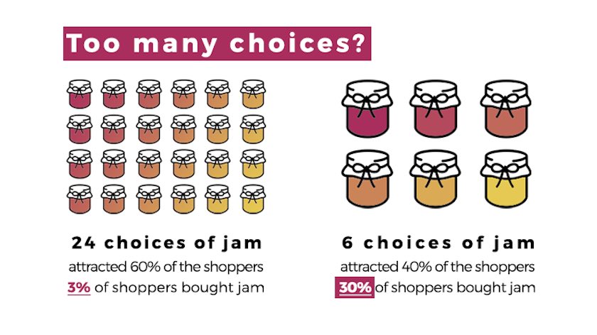
The paradox of choice observes that having to choose from many options makes it difficult for people to decide what they want. Providing too many options can make people feel anxious or confused.
A study by Sheena Iyengar and Mark Lepper revealed how having too many options influences people.
The researchers set up a display table for tasting gourmet jam. There were six flavors, and shoppers were free to try as many as they liked. In another instance, they created a more extensive range with 24 different jam flavors. They wanted to observe which scenario made people buy a jar of jam or taste some of the jam. The results are fascinating:
Source
This study concluded that while having many options might seem attractive to consumers, it could cause them not to make any decisions.
The Concrete CMS case study on Sharps’ website, a fitted furniture brand in the UK, showed that excess choices could overwhelm users on your website. Rawnet restructured the product categorization around more consumer-facing terms, using room types instead of ranges which resonated with the customer through their decision-making process.
To improve your visitor’s experience, limit options like how many types of products prospects have to choose from. Instead, group various products and offerings into more specific categories. Doing this will help your customers narrow their choices and help them make decisions faster.
 Source
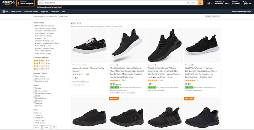
Amazon uses this strategy. In the image above, the search for “black shoes” returns a series of options. But on the side, you’ll find specific filters to help customers find what they want. That is one way Amazon addresses the paradox of choice. They don’t want potential customers to get stuck on too many options.
Source
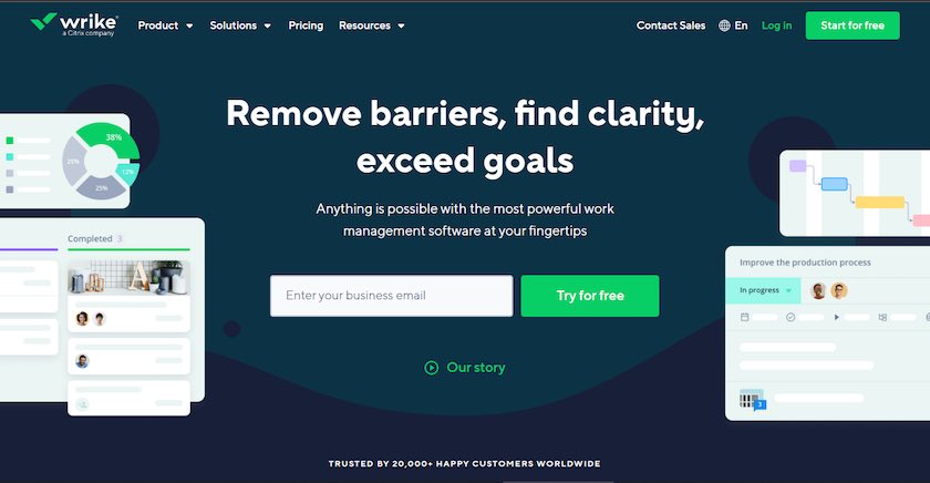
Consider reducing the number of calls to action on your webpage or highlighting one CTA to help your visitor decide. The software company, Wrike, helps users by highlighting the call to action button “Try for Free” on their homepage, although there are other actions visitors can take on the website (there are other CTAs). That’s another excellent example of the isolation effect at play, which we’ll discuss later.
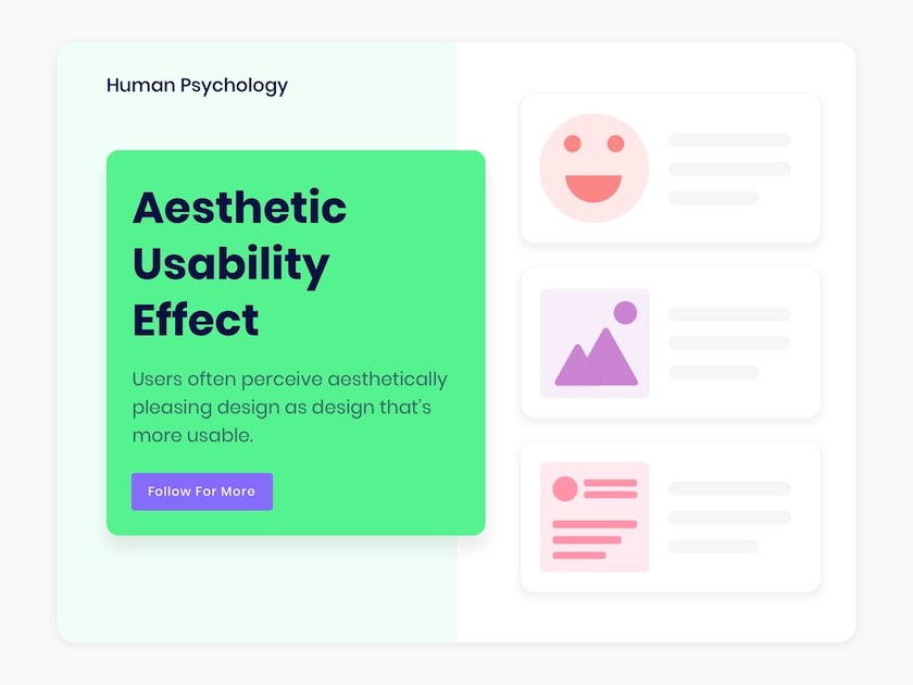
Aesthetic-Usability Effect
The aesthetic-usability effect is based on the idea that users believe that things work better when they look better. When the design is aesthetically pleasing, users are more willing to overlook minor problems when interacting with your website.
 Source
Researchers Masaaki Kurosu and Kaori Kashimura tested 26 variations of ATM user interfaces in their first study of the Aesthetic-Usability Effect in 1955. They asked participants to rate each design by considering its ease of use and aesthetic appeal.
The researchers found that the aesthetics of any user interface influences how users perceive functionality.
On this note, we see that a good visual design ensures that your site evokes a positive response from your users.
Your company website should have an enticing balance of aesthetic design and usability. We’ve seen that users prefer to interact with a site that looks good and has breathing space.
 Source
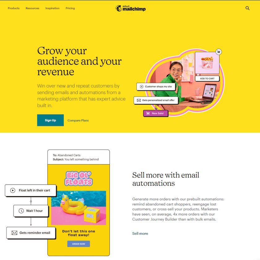
For instance, the email marketing platform, Mailchimp, uses a vibrant color scheme and graphics on its homepage that encourage users to navigate the site when they land there.
However, you should optimize your site for speed and responsiveness. It is also advisable to use a reliable web host to avoid downtime. With this, you pair up the beauty of your site with quality content and great functionality.
Value-Added Proposition
Another point we’ll explore in the psychology of website design is the value proposition. A value proposition is a promise to deliver and create value. It is also a customer's expectation of how they will receive and experience the value you offer – the link between what you have and why customers want it.
Applying smart design psychology leads you to reveal your value proposition clearly. This case study on ITV media shows that your value proposition should communicate your unique offering to your potential customers.
For your website to bring meaning to your audience, it must relate to their needs. Therefore, you need a clear value proposition in strategic places like your website homepage and main landing pages.
Your value proposition determines if people will read more about your product or abandon your site.
 Source
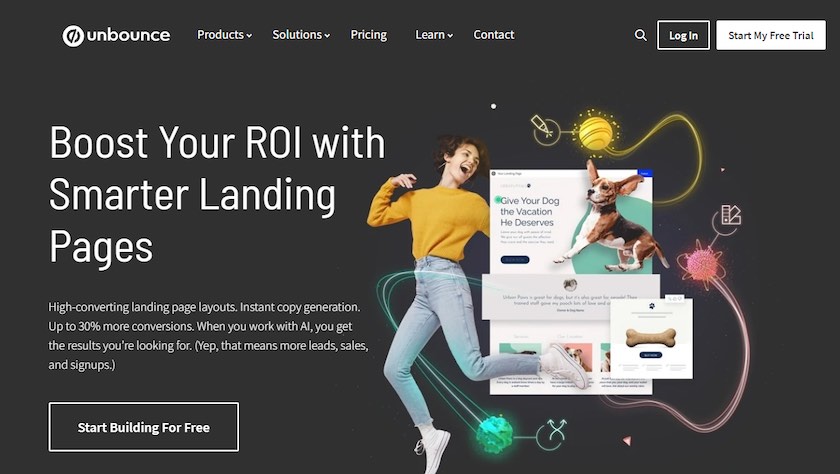
Also, when creating your value proposition, communicate with a visual element, attention-grabbing headlines, and calls to action.
From the above example, the software company, Unbounce does this. They use enticing design elements and offer a clear value proposition in the website elements—smarter landing pages, high-converting landing pages, and instant copy generation, among others. This is followed by a clear CTA.
If you need help crafting a compelling value proposition for your brand, using an AI writing assistant will give you some good ideas.
A value proposition is a primary key to improving the conversion rate on your website.
Isolation Effect
The isolation effect is also called the Von Restorff effect. It states that in a group of several items with similar features, people will most likely remember any item that is different from the rest.
Hedwig Von Restorff, a German psychiatrist and pediatrician, discovered this. In 1933, she released a study showing her observation that participants remembered distinct objects within a bunch of similar ones.
Web designers help consumers remember essential features and key offerings on a website by isolating one option or feature from others. That is why call-to-action buttons on some websites have an accent color that stands out from the white space and other web page items.
 Source
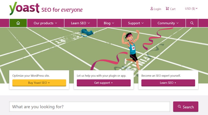
See how the SEO company, Yoast, highlights the “Buy Yoast SEO” button using a different color. This distinct feature makes it easy to spot the button.
On your website, look for ways to draw attention to essential actions by highlighting them with a distinct visual attribute or using a vibrant color scheme. That encourages visitors to notice and take the desired action.
Zeigarnik Effect
When people begin a task, tension builds until they complete it. If the task remains unfinished, this tension causes them to remember that they have something pending. When we complete the task, the tension goes away. That’s the Zeigarnik Effect.
The Zeigarnik effect was first noticed by Russian psychologist Bluma Zeigarnik. She observed how a waiter took orders. The waiter had a better recollection of unpaid orders than paid ones. As a result, she concluded that people remembered uncompleted tasks better than completed tasks.
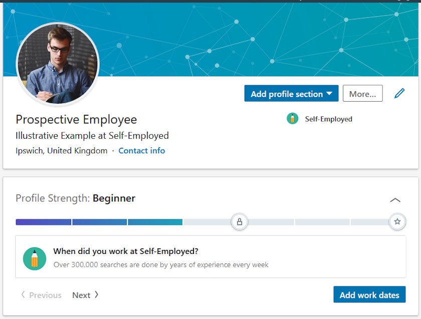
In the psychology of website design, the Zeigarnik effect comes into play when sites display large content in smaller bits. That works especially when you are creating pillar pages on your website and want to send visitors there.
 Source
Web designers use the Zeigarnik effect to help users finish uninteresting tasks. It’s at work when sites use progress bars, like the LinkedIn profile example above, to show users how close they are to completing their profile or finishing a course on their website.
Using the Zeigarnik effect on your website will help create interest in tasks people would otherwise abandon.
You can lure site users into taking action by creating a sense of curiosity about your product or content.
Serial Position Effect
Also known as the primary and recency effect, the serial effect refers to people’s ability to easily recall the first and last items in a list of information more than the items in the middle.
Herman Ebbinghaus, a German psychologist, developed the serial position effect based on tests he conducted on himself. He discovered that an item's location on a list influences one’s ability to remember it.
When you apply the serial position effect correctly, it reduces the strain on your consumers’ memory while using your website.
 Source
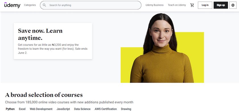
Udemy uses large text at the beginning of the page against that white space to tell users that they can save costs and learn anytime by availing their courses. They also mention in big letters that they offer a broad selection of courses. These are the first things users will see on their homepage.
You should make it easy for users to remember critical details about products or services on your website. Do that by including those details at the top of your website or landing page. That increases their chances of remembering your message and taking action.
It’s also worth pointing out the importance of maintaining consistency across your website. Users should see brand consistency when browsing through your landing pages and blog posts. Similarly, someone landing on your website after clicking your social media posts should have a consistent experience.
You can deliver that by identifying your brand voice and tone and creating a style guide. Your team should use the guide to maintain a consistent brand voice across all materials. From the copy on your website and landing pages to your social media, and email.
Summary
Visual design involves various components like graphic design, user experience design, interface design, and content creation. The combination of these components helps you create an effective web design.
A good combination of these elements will help ensure your website’s aesthetic appeal. But beyond ensuring your site looks visually stimulating, effective design guides your visitors to take action on your website.
You’ve seen how the psychology of website design can impact consumer behavior on your site. Leverage these theories and make them work for you.
Nicholas Rubright is the communications specialist for Writer, an AI writing assistant designed for teams. Nicholas has previously worked to develop content marketing strategies for brands like Webex, Havenly, and Fictiv.
Sources: