
94% of people say easy navigation is the most crucial feature of a website.
When creating any website, you need to make it easy to navigate so visitors can find what they need. Navigation menus appear most commonly in page headers or sidebars across a website, allowing visitors to access the most helpful pages quickly. Here are some common navigation problems and industry standards.
Navigation is more than a menu in a header.
When users visit eBay or Amazon, the first feature you see is a search bar. A sidebar menu and header navigation are not the only ways users navigate a website. Making sure users can navigate a site in multiple ways is essential. For example, a user may use a search vs. clicking on a menu. Other Examples of navigation features include:
- Visual Sitemap
- Tags
- Breadcrumbs
- Footer Navigation
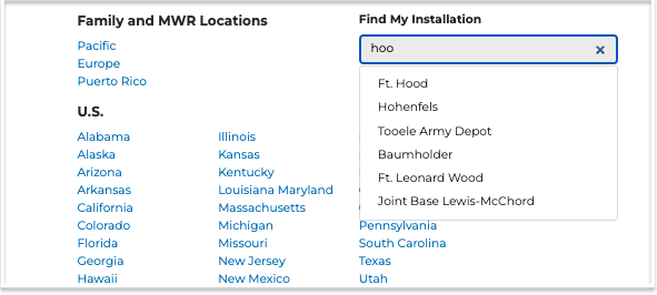
When to use Alphabetical Navigation Lists
While not used as often, Alphabetical navigation lists are found on directory websites or where users may need to choose a specific location. For example, a Veteran looking for things to do on vacation may choose the state they are visiting. In comparison, a newly relocated soldier will know their installation name and start with the find my installation.
Use the Active and Hover State in a Menu
Use the "active" state to show users which page they have navigated to. Indicate what page someone is on within the hierarchy of your website.
Highlighting the current navigation helps the user take the next step and click on the proper selection. Another option is to use breadcrumbs to show where a user is in the navigation. https://documentation.concretecms.org/building-website-concretecms/9-making-our-header-work/4-add-an-active-state-to-the-header-navigation
Non Responsive Website Navigation
Remember, at least half of your website audience is likely on a phone. On mobile, we navigate with our fingers, not a mouse or trackpad.
Ensure that your website navigation is responsive and includes a hamburger menu when the visitor uses a mobile device.
Standards
It challenges your site visitor if the navigation is in an unconventional place like the middle of a page. Make it easy on your site visitor by using navigation styles and designs that are most common on websites. For example, that means placing the navigation bar along the top or to the left of the screen and using a hamburger icon on mobile to make it easy for visitors to find the right page they want. 
Have you ever been to a restaurant where the appetizer menu is on the back? Confusing right? This is something that applies to website design, too. If you want visitors to find contact information, then place it at the end of your navigation bar. Privacy policies belong in the footer, these are all standard practices that should be followed.
Descriptive and Short Menu names
Remember that you really need to communicate with visitors to your site.
Use more descriptive labels so it's easy to find what you're looking for on your site. Keep the navigation links short. They can be shorter derivatives of page titles themselves. If you use generic labeling, your customers find it complicated to find what they need on your site.
Many Navigation Links vs. the Golden Rule of 7.
Almost every blog about navigation mentions the rule of 7 menu items or less. The Magical Number Seven, Plus or Minus Two: is written by George A. Miller a Harvard University from (1956)
Common cognitive research shows that the human brain is only able to hold around 7 items in short-term memory and now the entire industry has adopted this.
Pro Tip "Users are not on your website trying to memorize your top navigation level links."
Let's take a look at the top developer websites for instance:
- Slashdot
- Hacker News
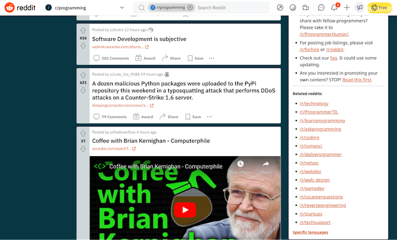
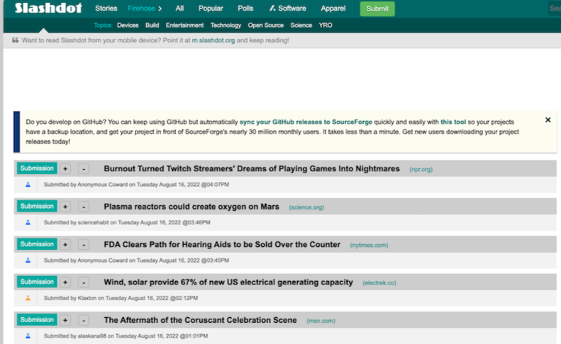

Developers love lots of links and minimal design, and so do eCommerce shoppers. Amazon and eBay have well over 50 links in their menus.
Keeping the items on your homepage to 7 or below is sensible for smaller focused sites to help visitors easily navigate to the correct page. On the contrary keep in mind that there are great use cases for the firehose of links on much larger websites.
Dead Ends
It's frustrating when you're trying to navigate a site and you find yourself in a dead end. You want to avoid that for your website. Ensure that all areas that users can navigate to are fully developed, so no linking to under-construction pages or 404 pages.
Accessibility
Make sure your navigation is accessible. Accessibility is one of the most critical processes in web development today. For local and state governments, website accessibility is the law.
Here's a quick short list of tools to assist with accessibility requirements.
Free and Open Source Accessibility Tools
Listed below are great examples of open source in government. The Social Security Administration created Free and Open Source (FOSS) tools that can be used to test sites for Section 508 and WCAG compliance in browser: (Screen Shot)
- ANDI (Accessible Name & Description Inspector), developed by the Social Security Administration, is a free open-source bookmarklet, which means that the tool does not require installation as a plugin and can be added to multiple browsers as a bookmark. Install ANDI
- Color Contrast Analyzer (CCA), Group, is a free open-source tool that displays the contrast ratio for two selected colors.
- The W3C maintains a comprehensive list of web accessibility evaluation tools.
Now you know all the common navigational issues with sites, and you'll be able to avoid them when you create yours.